Overview
You can customize the appearance of the banner of an app. This article explains how you can edit every available option for you to customize your banner.
Access the banner settings
To access the appearance options for the banner of your app follow these steps.
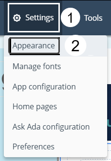
Click the Settings button and select the Appearance option.
Click the Edit button located next to the Banner label.
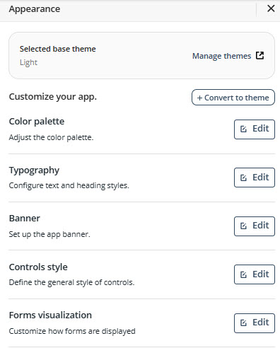
By clicking this button, all available configuration options open
General
Under the General tab you can find the following appearance configurations.
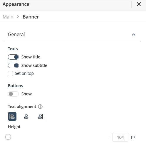
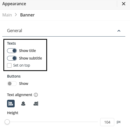
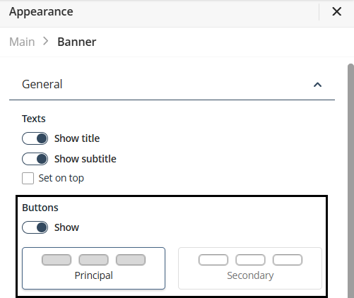
Texts
Under this option you can configure the locations and visibility of the page title and subtitle.
To change the visibility of the title of a page, deactivate the Show title switch option
To change the visibility of the subtitle of a page, deactivate the Show subtitle option.
When the Set on top checkbox is active, the subtitle is displayed on top of the title. If it is not active, the title is displayed on top of the subtitle.
Buttons
You can enable or disable header buttons to display the user's Actions.
To do this, activate the Show option under the Buttons label. Once enabled, you can change the button theme by selecting either the Primary or Secondary options.
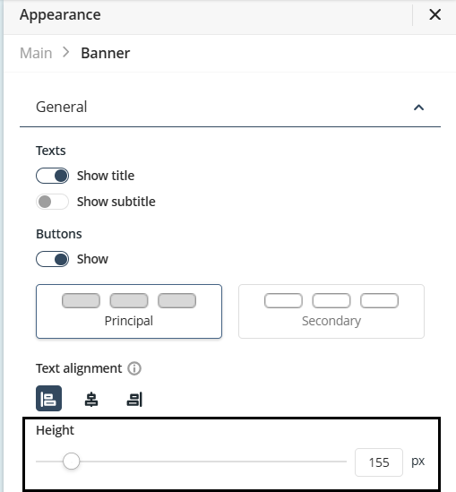
Text align
You can adjust the text alignment of the banner. To do this, under the Text Alignment label select your preferred option to align the text of the banner. The available choices are:
•Align left
•Center
•Align right
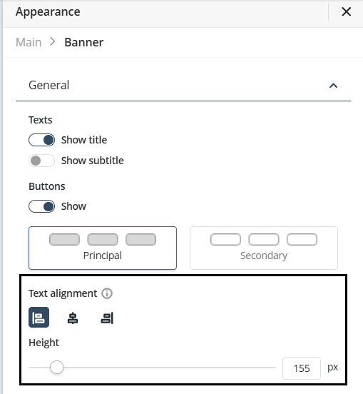
Banner height
You can adjust the banner height by modifying the slider below the Height label. The banner size, in pixels, is displayed to the right of the slider.
Background
Under the Background tab you can find the following appearance configurations.
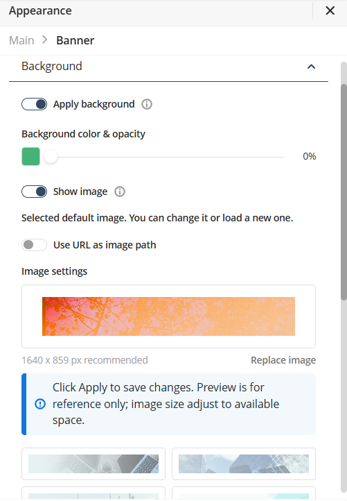
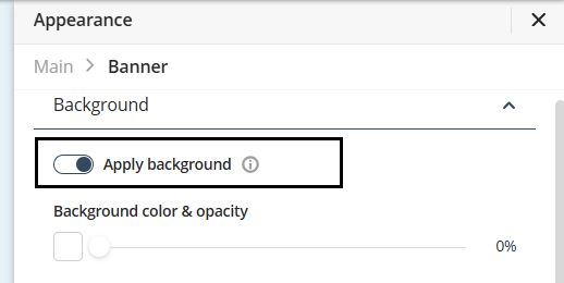
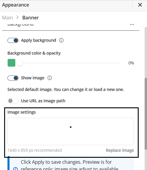
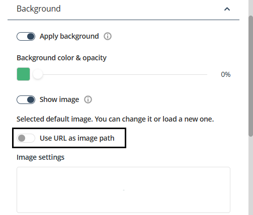
Apply background
You can apply a background to the banner, to do this activate the Apply background switch.
After activating it, you can select between a color or an image for the background of your banner.
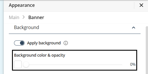
Use a color for the background
To apply a color to the background of the banner of your app follow the next steps.
Under the Background Color & Opacity label, you can select the background color and opacity. To choose a color, click the rectangle below Background Color & Opacity.
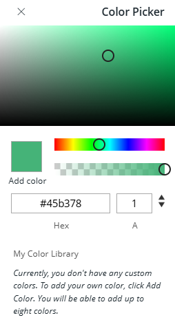
Select a color from the Color picker.
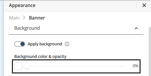
Adjust color opacity
You can adjust the opacity of the selected color. To do this use the slider next to the rectangle showcasing the color selected for the background. The opacity percentage is displayed to the right of the slider.
Use an image for the background
To add an image to your app's banner background, follow these steps:
Under the Appearance tab, activate the Show image switch option.
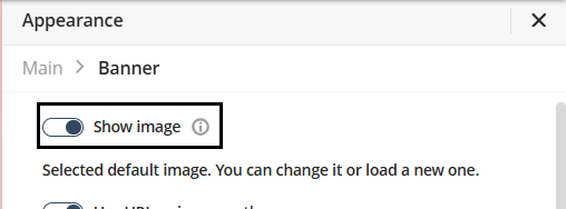
Once activated, Bizagi applies a default background image to your banner. You can replace the default image with one of Bizagi’s predefined options or use a custom image.
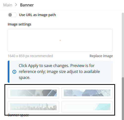
Use a predefined image
To use one of Bizagi’s ready-made images, choose an option located beneath the Replace Image option.
Use a custom image
When using a custom image, you can choose either a locally stored image from your device or an image uploaded to the internet as the background for your banner.
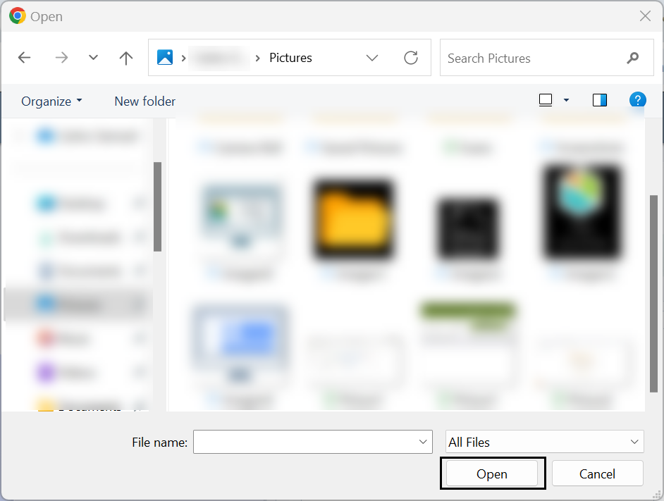
To use a local image stored from your device, click the label Replace image.
Take into account that the recommended size of the image 1640px x 859px.
Select the image from your device and click the Open button.
To use an image uploaded to the internet follow the next steps.
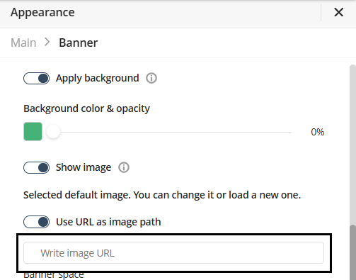
Activate the Use URL as image path switch option.
When you enable the Use URL as image path switch, the Write image URL text box appears below it. In this text box, paste the URL of the image you want to use. The URL must link to an image that is uploaded and accessible on the internet.
Customize background image
After defining the background image, you can modify several visual aspects of the banner.
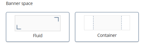
Banner Space
You can modify the space occupied by the background image of the banner. You can choose between the following options
•Fluid: Makes the background fill the entire banner.
•Container: Limits the background to a centered area within the banner, leaving the sides without a background.
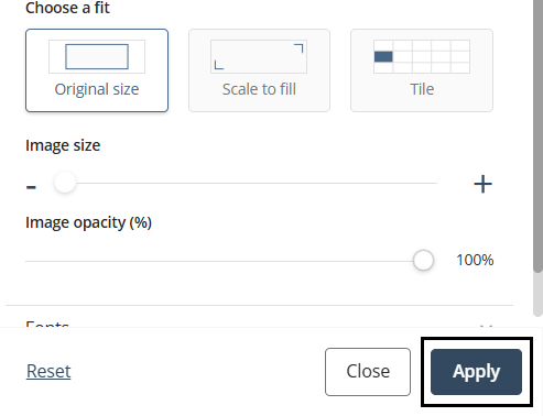
Fit
You can adjust how the background image fits
•Original size: scales the background image to its original size.
•Scale to fill: scales the background image to fit in the space defined by the banner.
•Tile: Scales the image to fit in a tile and divides the banner into multiple tiles, each tile displaying the background image.
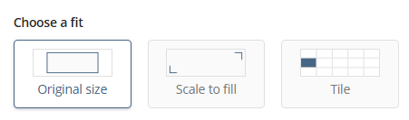
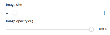
Image size & Opacity
You can modify the background image size. Simply adjust the slider located beneath the Image size label. This only modifies the size of the background image, not the size of the banner itself.
Also, you can adjust the background image's opacity using the slider located beneath the Image Opacity label. The percentage value appears to the right of the slider.
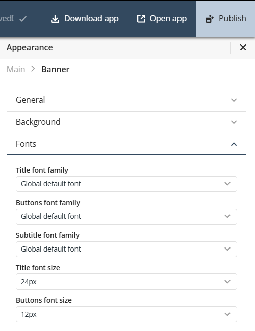
Fonts
In the Fonts tab you can define the title, subtitle or buttons font and size. Each font or size is independent of the other. The default subtitle font family is Poppins Regular.
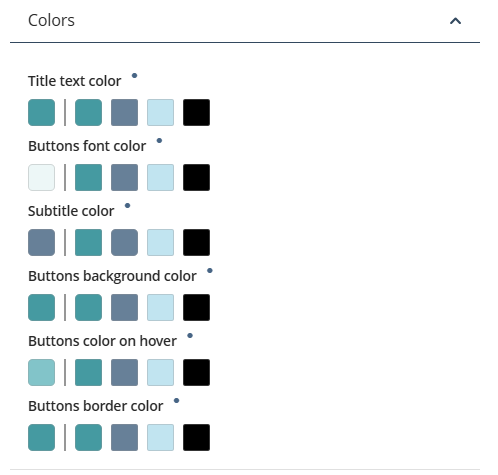
Colors
In the Color tab you can define the color of the title, subtitle, buttons, background, hover, and border separately.
Finish configurations
Once you have configured the appearance of the banner of your app click the Apply button located at the right bottom of your screen.
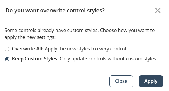
This opens a confirmation window. Select one of the following options:
•Overwrite All: Apply the new styles to every control.
•Keep Custom Styles: Only update controls without custom styles.
Once selected, click the Apply button.
Last Updated 11/19/2025 12:01:06 AM