Overview
The Banner control allows you to define a global page header which usually includes a logo, company name, slogan, page title, and subtitle. With this control, you are able to display any image at the top of a page for customization and personalization purposes. Moreover, it gives users the ability to set custom titles and subtitles that are implemented in all the apps when created.
This article describes the essentials for implementing a Banner control.
Add a Banner
The default behavior of any app is to include the title and subtitle when the app is created. You can access the control's settings by clicking the Banner; a blue box surrounds the control, and the Manage and Settings buttons are shown in the top-right corner of the control.
If this control is removed, it can be found in the Controls tab in the Banner section as follows:
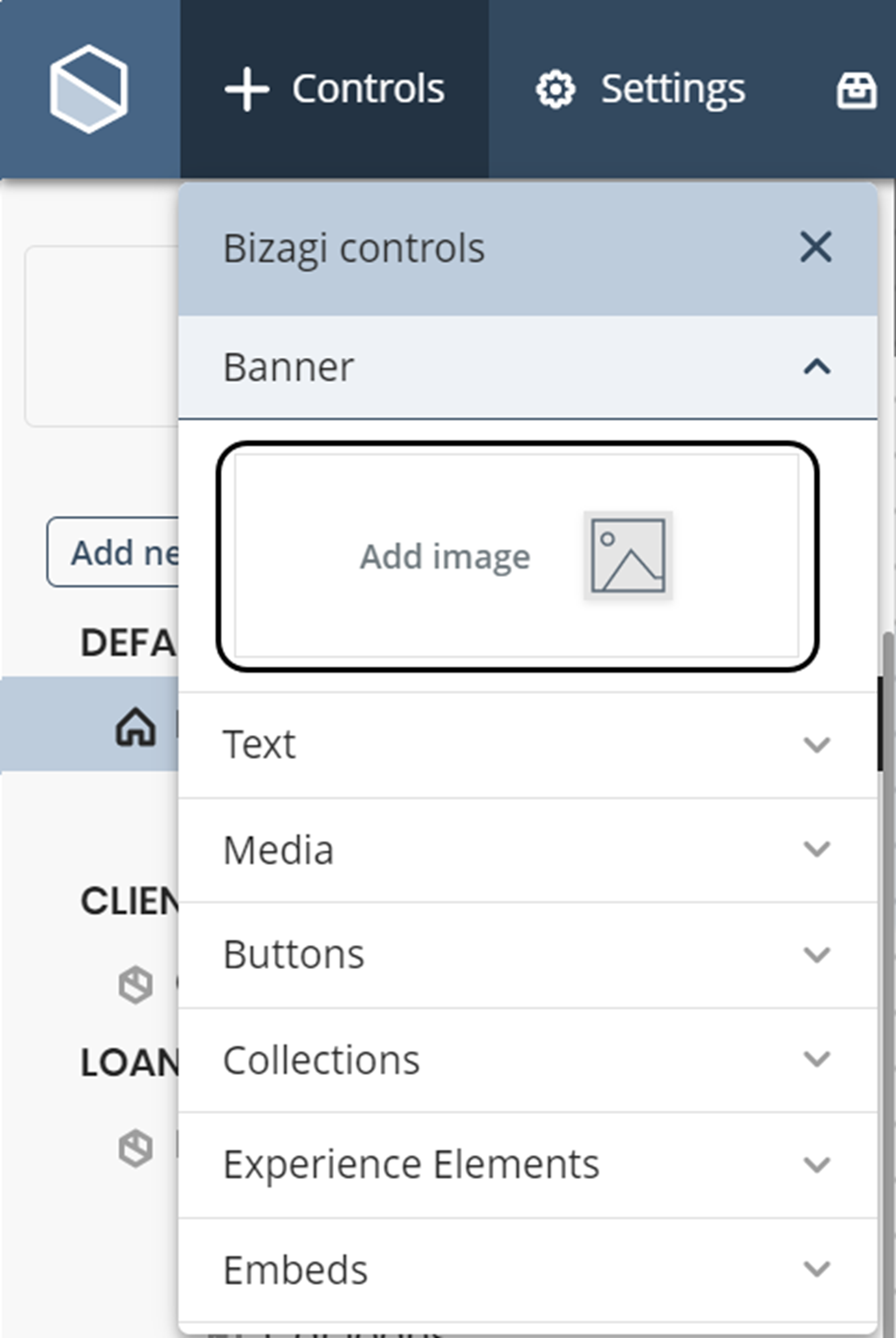
1.From the upper menu, select the Controls option. A drop-down menu will display all the different control types available.
2.Select the option Banner, and then click Add image.
Settings
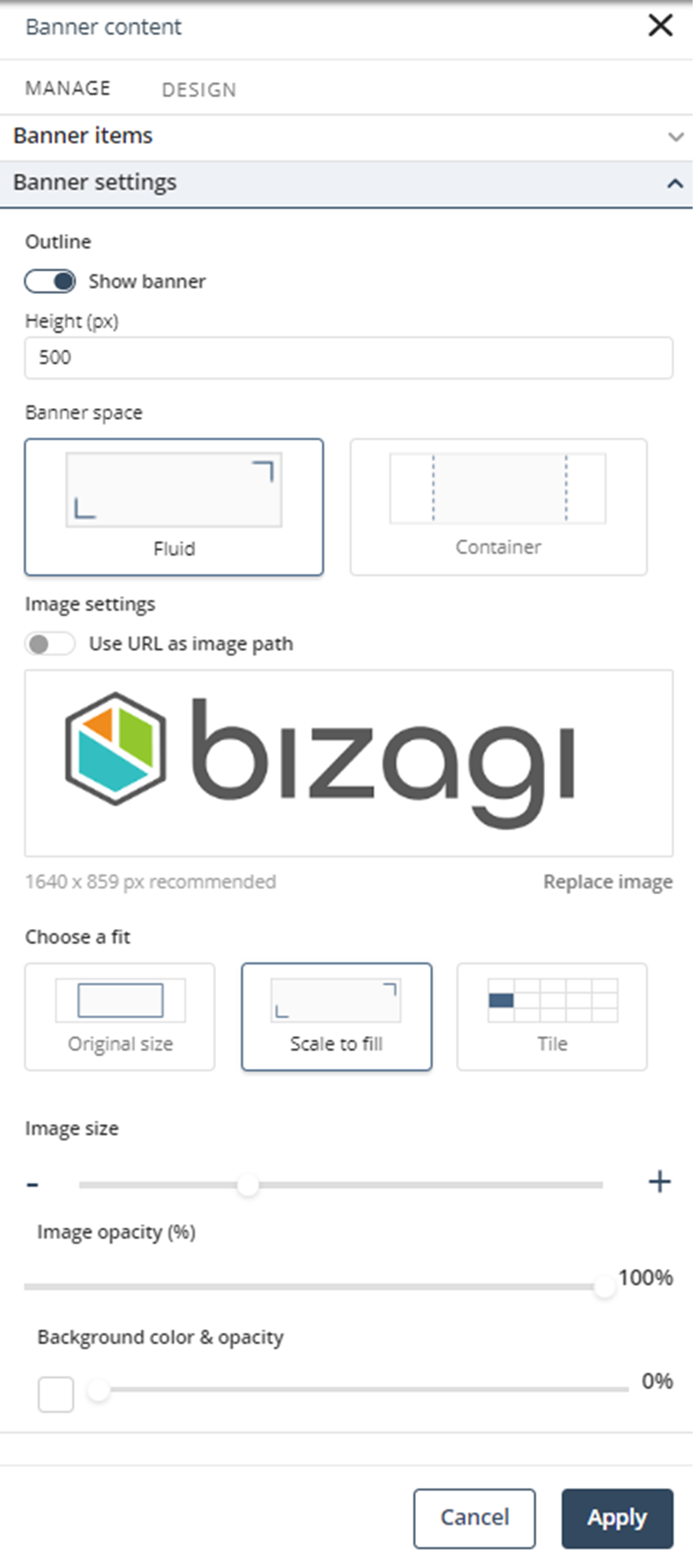
Manage
In the Manage tab, you are able to configure everything related to the content of the Banner title and subtitle, and image settings.
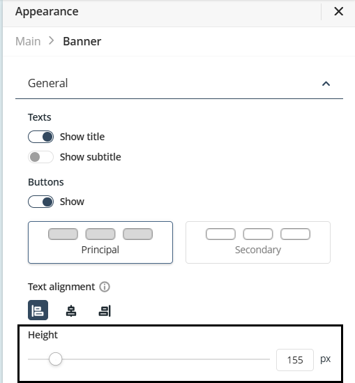
General
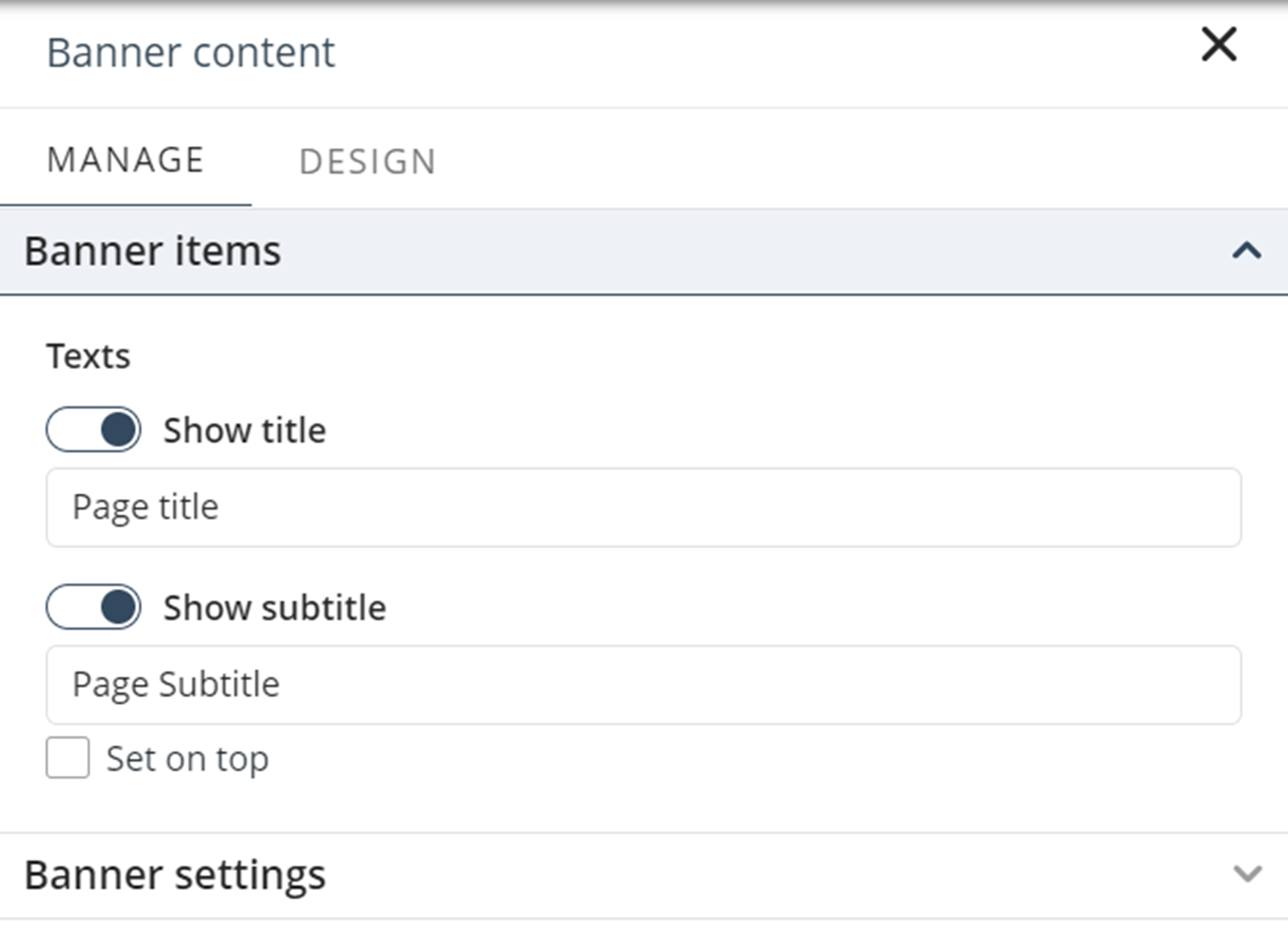
Here you can customize the control title and subtitle. For each one of them, you can:
•Decide whether the title or the subtitle is visible or not.
•Define the content of the title or subtitle.
•When the Set on top checkbox is active, the subtitle is displayed on top of the title. If it is not active, the title is displayed on top of the subtitle.
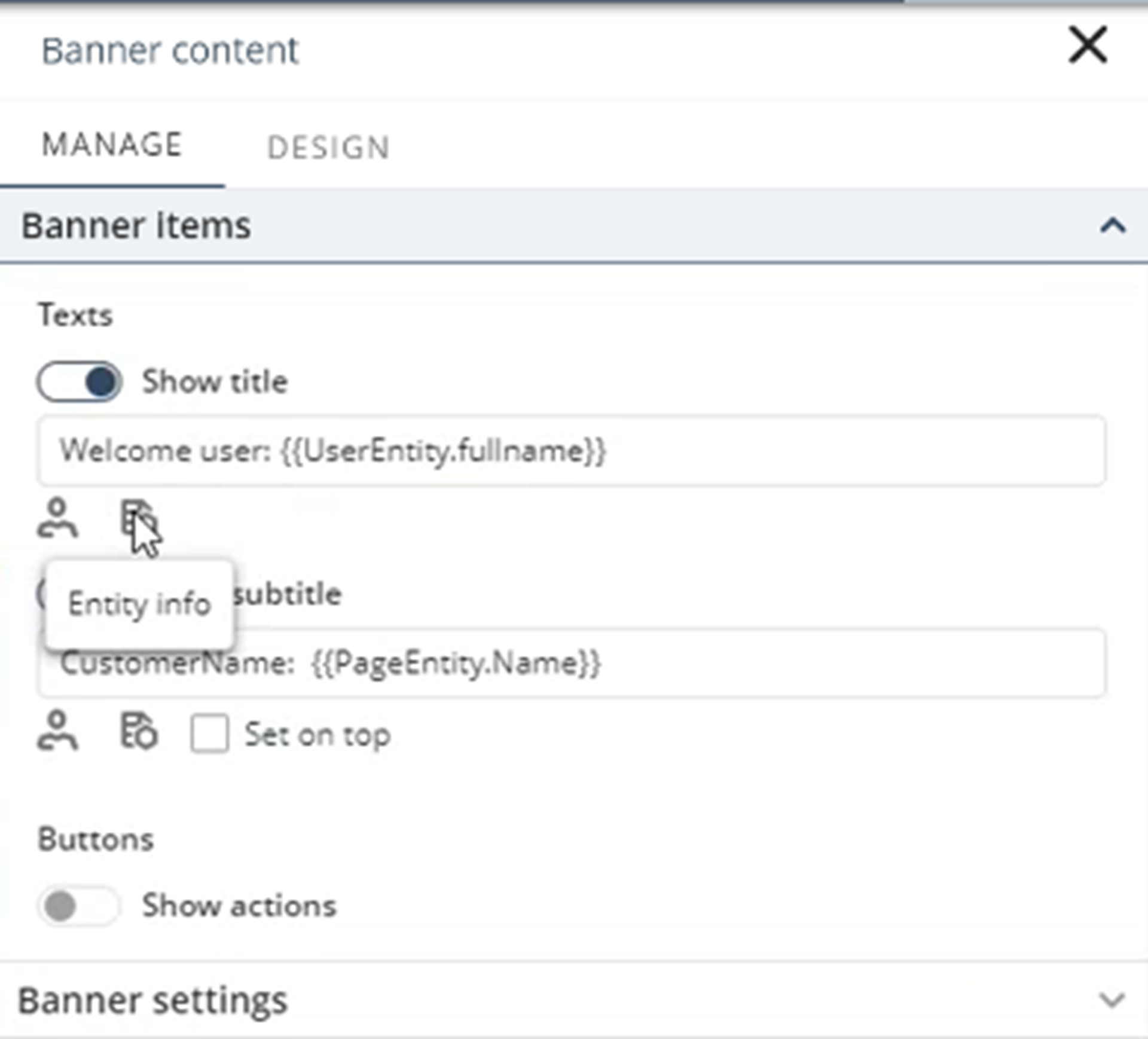
When configuring the Banner content in a Private or Detail page, new options appear in the Manage tab.
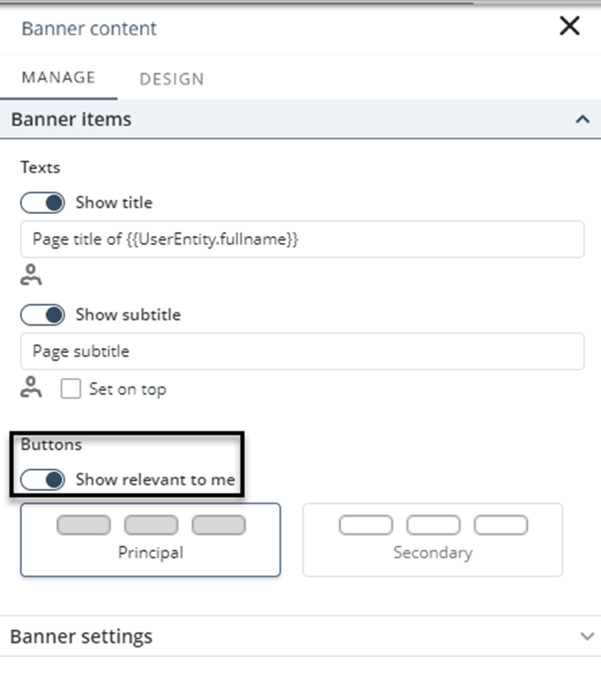
Private pages
In Private pages you can add user information to your texts by clicking the User info button as follows:
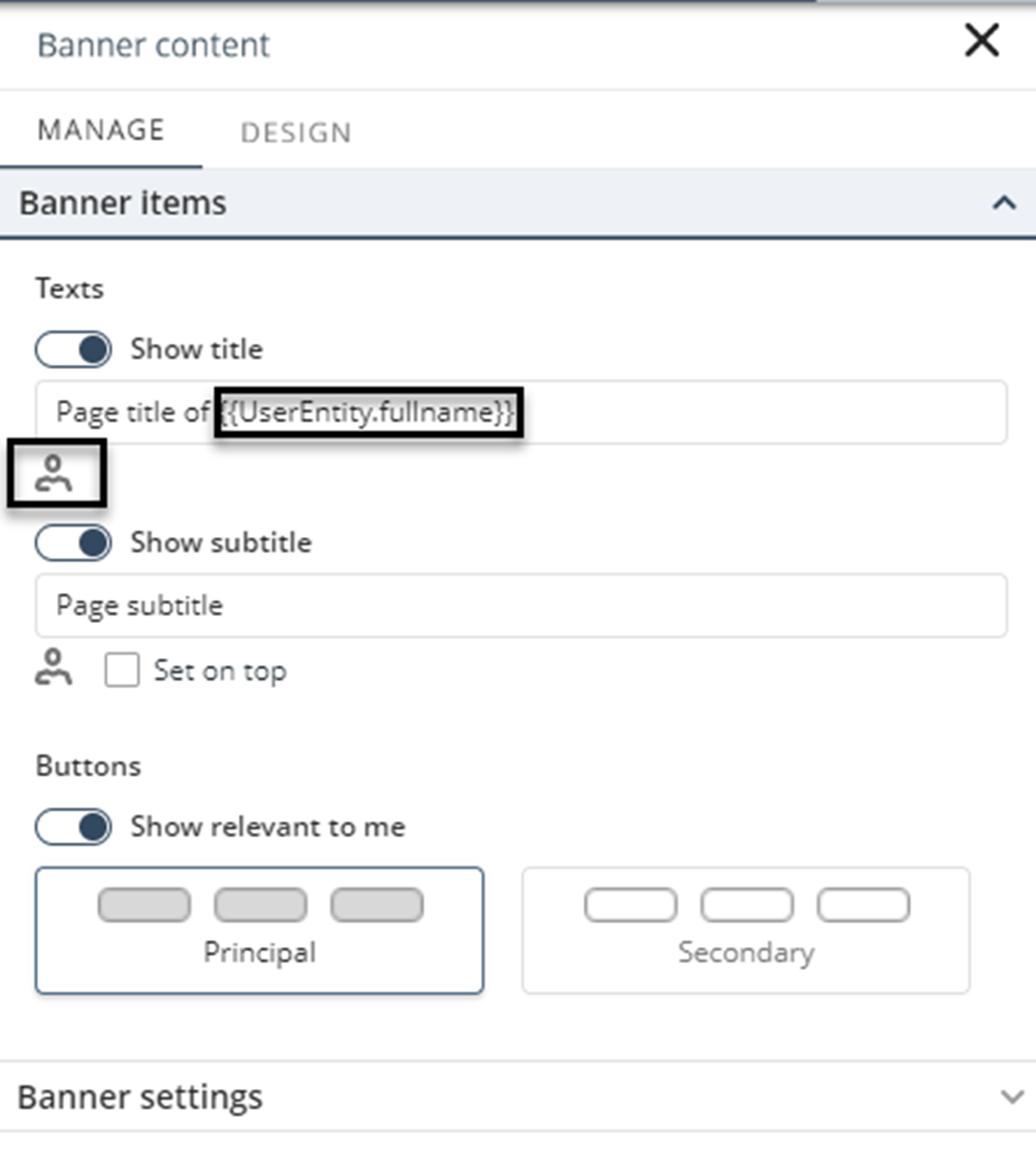
Also, you can enable or disable header buttons to show the user's Relevant to me actions. You can change the buttons theme by selecting the principal or secondary options.
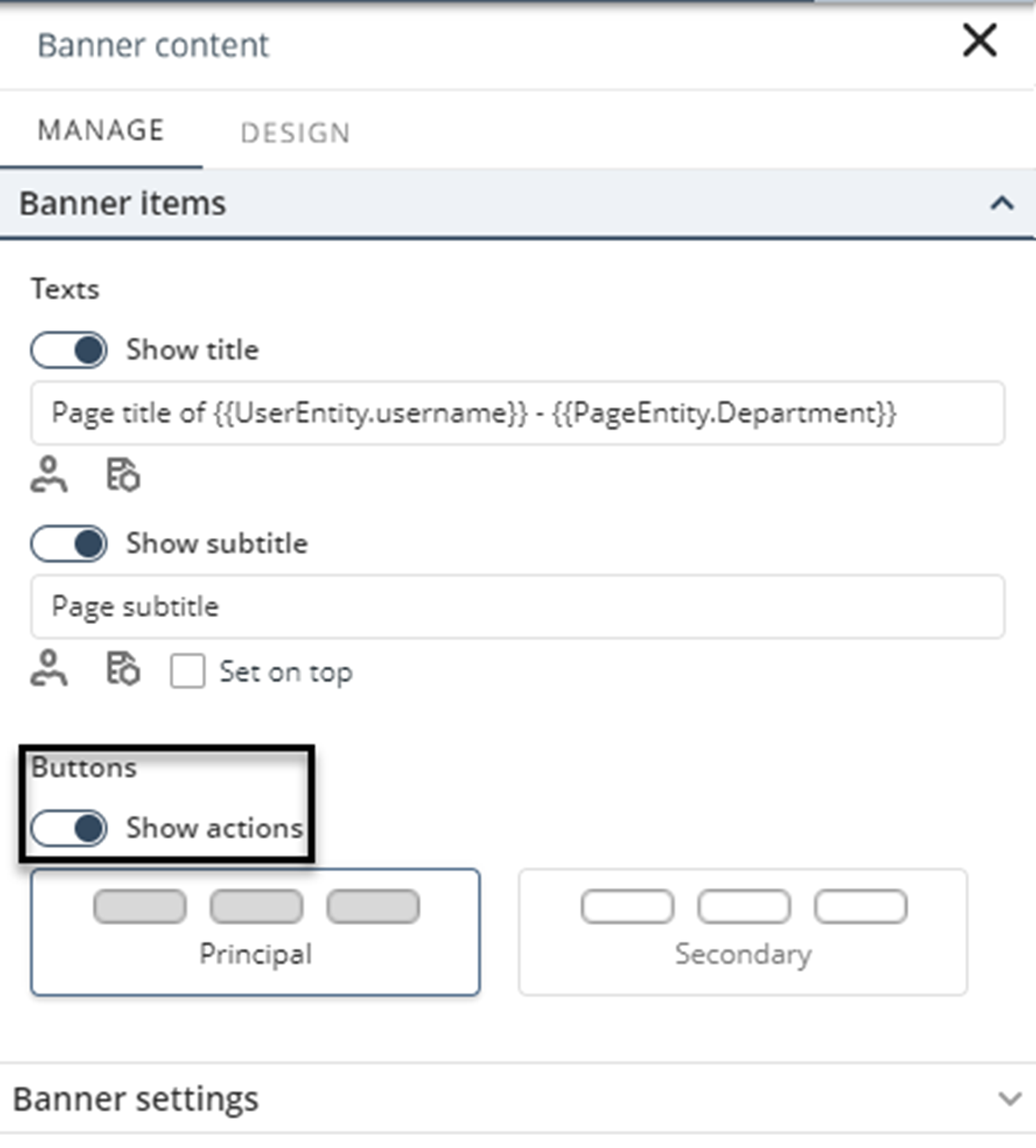
Detail pages
In Detail pages you can add user information to your texts by clicking the User info button. Furthermore, you can add Entity information by clicking the Entity info button as follows:
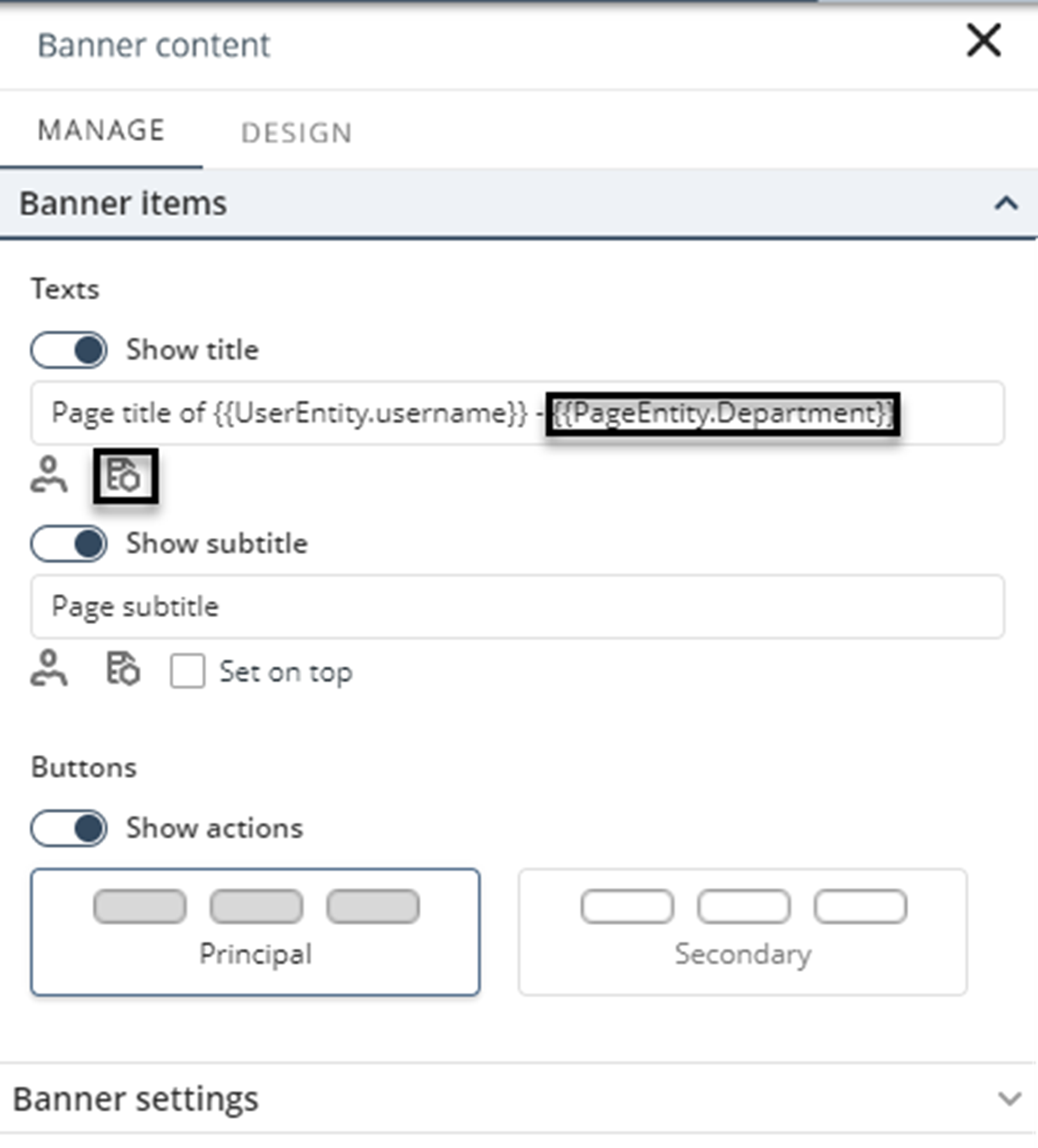
Also, you can enable or disable header buttons to show the user's Actions. You can change the button's theme by selecting the principal or secondary options.
Height
You can adjust the banner height by modifying the slider below the Height label. The banner size, in pixels, is displayed to the right of the slider.
Background
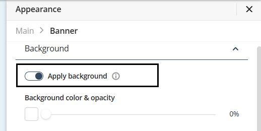
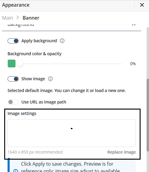
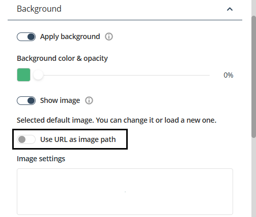
Inside the Banner settings, you are able to configure everything related to background of the banner, as in the following image:
Apply background
You can apply a background to the banner, to do this activate the Apply background switch.
After activating it, you can select between a color or an image for the background of your banner.
Use a color for the background
To apply a color to the background of the banner of your app follow the next steps.
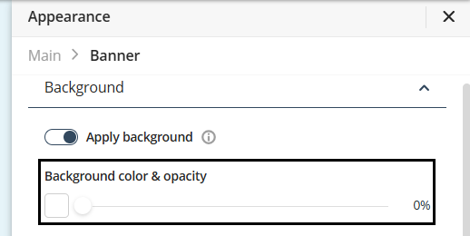
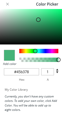
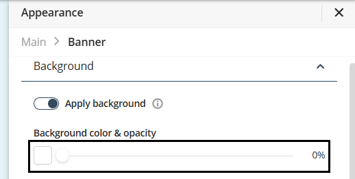
Under the Background Color & Opacity label, you can select the background color and opacity. To choose a color, click the rectangle below Background Color & Opacity.
Select a color from the Color picker.
Adjust color opacity
You can adjust the opacity of the color selected. To do this use the slider next to the rectangle showcasing the color selected for the background. The opacity percentage is displayed to the right of the slider.
Use an image for the background
To add an image to your app's banner background, follow these steps:
Under the Appearance tab, activate the Show image switch option.
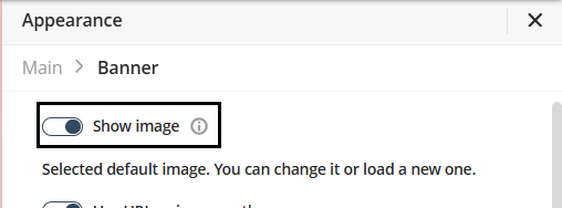
Once activated, Bizagi applies a default background image to your banner. You can replace the default image with one of Bizagi’s predefined options or use a custom image.
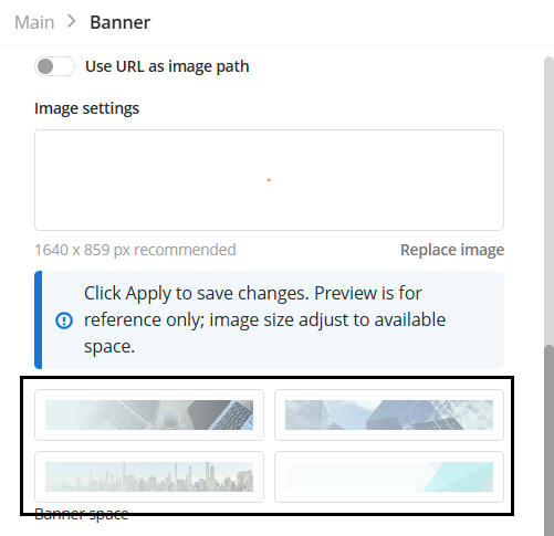
Use a predefined image
To use one of Bizagi’s ready-made images, choose an option located beneath the Replace Image option.
Use a custom image
When using a custom image, you can choose either a locally stored image from your device or an image uploaded to the internet as the background for your banner.
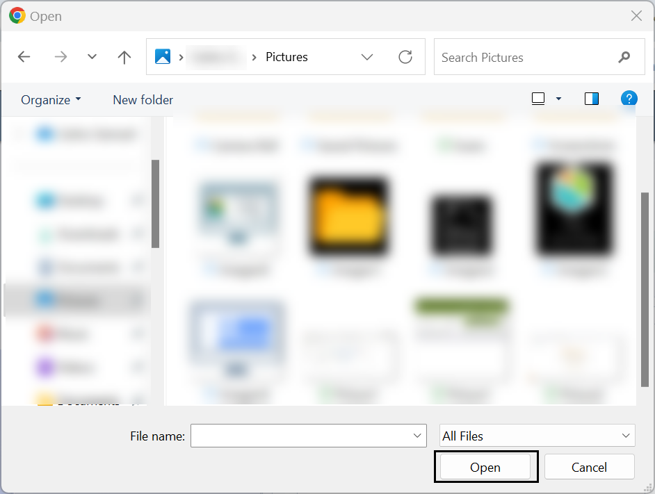
To use a local image stored from your device, click the label Replace image.
Take into account that the recommended size of the image 1640px x 859px.
Select the image from your device and click the Open button.
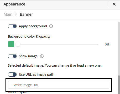
To use an image uploaded to the internet follow the next steps.
Activate the Use url as image path switch option.
When you enable the Use url as image path switch, the Write image URL text box appears below it. In this text box, paste the URL of the image you want to use. The URL must link to an image that is uploaded and accessible on the internet.
Customize background image
After defining the background image, you can modify several visual aspects of the banner.
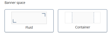
Banner Space
You can modify the space occupied by the background image of the banner. You can chose between the following options
•Fluid: Makes the background fill the entire banner.
•Container: Limits the background to a centered area within the banner, leaving the sides without a background.
Fit
You can modify the fit the background image has
•Original size: scales the background image to its original size.
•Scale to fill: scales the background image to fit in the space defined by the banner.
•Tile: Scales the image to fit in a tile and divides the banner into multiple tiles, each tile displaying the background image.
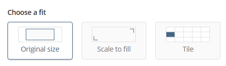
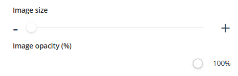
Image size & Opacity
You can modify the background image size. Simply adjust the slider located beneath the Image size label. This only modifies the size of the background image, no the size of the banner itself.
Also, you can adjust the background image's opacity using the slider located beneath the Image Opacity label. The percentage value appears to the right of the slider.
Design
In the Design tab you can customize the fonts and colors of the title and subtitle.
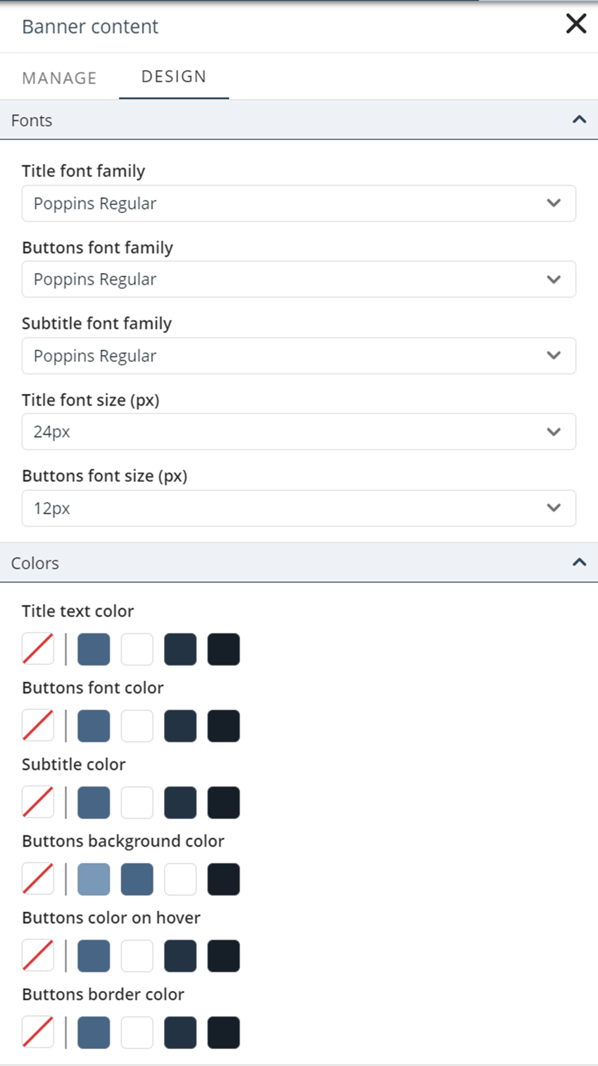
•Fonts: Define the title, subtitle or buttons font and size. Each font or size is independent of the other. The default subtitle font family is Poppins Regular.
•Colors: Define the colors of the title, subtitle, buttons, background, hover, and border separately.
Last Updated 5/3/2025 10:54:53 PM