Overview
In the App Designer editor, the Collections Search control lets you customize how users search for and interact with information in your app. This article explains how to add the control to a page and how to configure it to suit your needs.
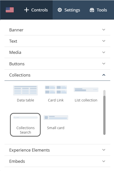
Adding the control
To add the Collections Search control to your page, navigate to Controls > Collections > Collections Search, then drag the control into the desired section of the page.
Configuration options
The Collections Search control provides the following configuration options:
Manage options
This section lets you define the control’s data source. Follow the steps below depending on whether you are using static or dynamic content.
Static content
Use these configuration steps when working with multiple fixed Collection controls.
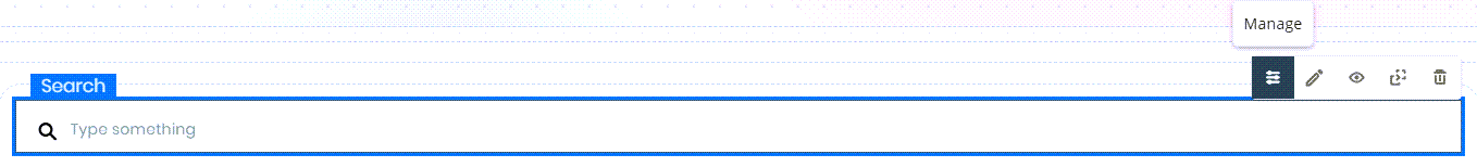
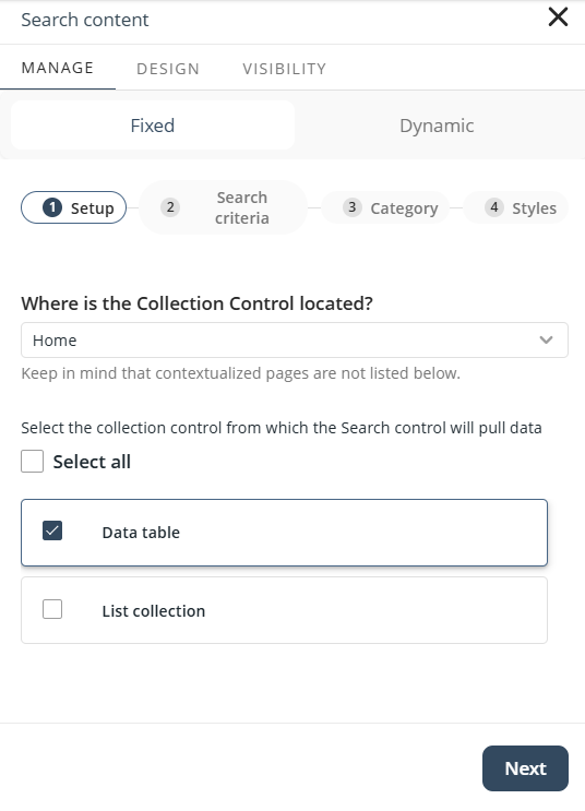
1.Click the Collections Search control and select the Manage option. Set the source type to Fixed.
2.Select the page location where the desired Collection controls are at from the drop-down list.
3.Click the checkboxes beside the Collection controls you want to include. If there are multiple Collection controls you want to include, you can click the Select all option.
Click Next.
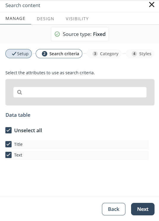
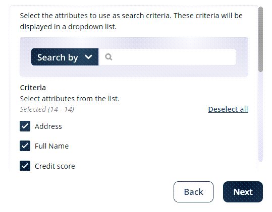
4. Choose the attributes to use as search criteria. These will be visible to Personas and determine how searches are performed. Make sure these attributes exist in all selected Collection controls.
Click Next.
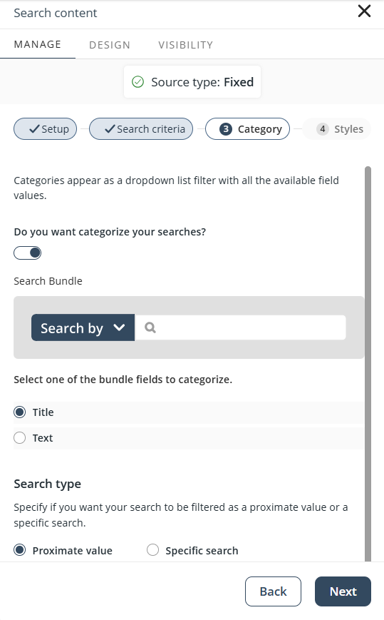
5. Optionally, enable categorization to allow filtering by category. The drop-down options are based on an attribute shared by all included Collections. Only attributes present in every Collection control will be available.
Click Next.
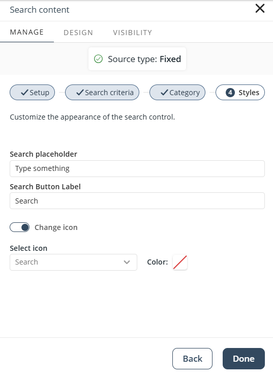
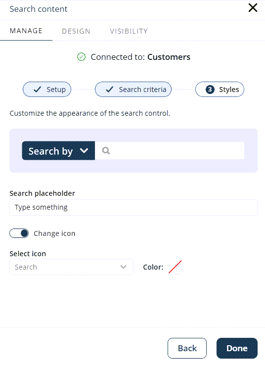
6. Customize the placeholder text, button label, icon, and icon color.
Click Done to complete the setup.
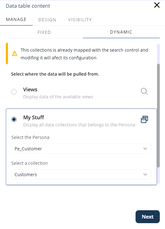
Dynamic content
Use these configuration steps when working with multiple dynamic Collection controls.
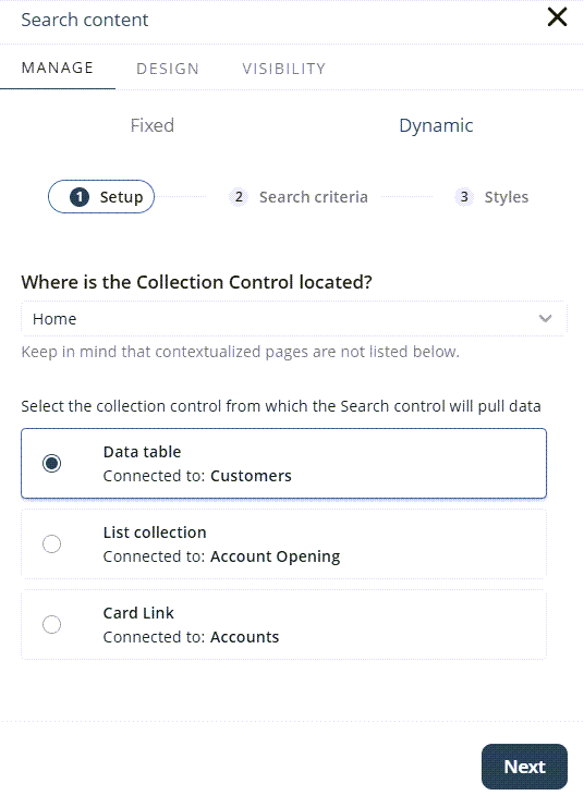
1. Click the Collections Search control and select the Manage option. Set the source type to Dynamic.
2. Select the page location where the desired Collection controls are at from the drop-down list.
3. Click the Collection control you want to include.
Click Next.
4. Select the fields to use as search criteria. These can be configured as either fixed criteria or variable criteria:
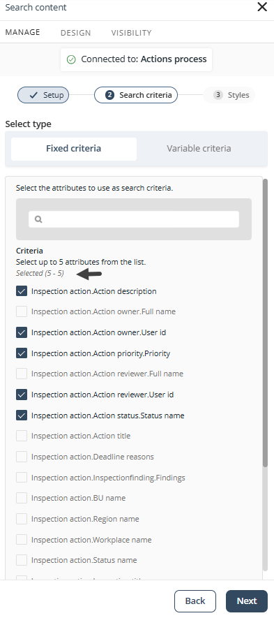
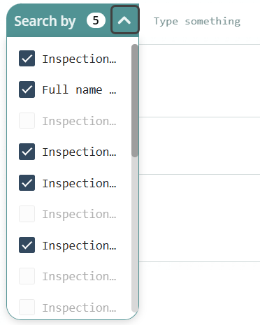
•Fixed Criteria: Define up to five attributes from the Collection control. The search will only use the selected attributes, and they will remain fixed for app users. This section also displays the number of attributes selected so far, helping you track the limit when working with long attribute lists.
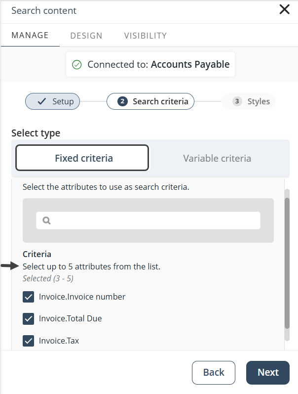
When you reach the five-attribute limit, remaining checkboxes will be disabled.
•Variable Criteria: Select multiple attributes to include in the search (there is no limit to how many you can add). Use the Select all button to quickly choose all attributes. These attributes will appear in a drop-down list in the published app. App users can run queries across all enabled attributes—up to five at a time—in a single search.
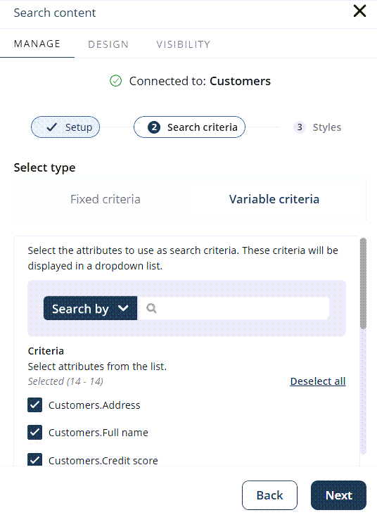
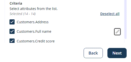
You can rename the attributes to improve readability in the published app. By default, attributes use their XPath names (e.g., Customer.FullName), but these can be changed. The new labels affect only the published app and drop-down list—not the underlying data.
To rename an attribute, hover over it. A pencil icon will appear next to its XPath name, click the icon to enable editing.
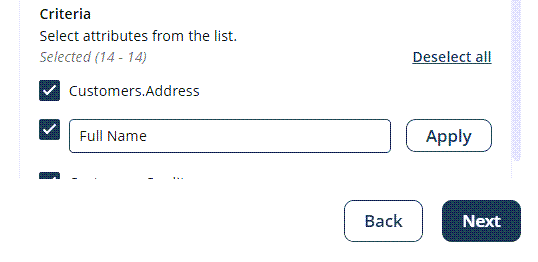
Enter a new label and click Apply.
A preview of the Collections Search control is provided so you can review selected attributes and drop-down behavior before completing the setup.
Click Next.
5. You can customize the search placeholder, search button label, category label, and icon in the Styles step.
Click Done to complete the setup.
Behavior in the published app
When configured with a Dynamic data source and Variable criteria, app users will see the following behavior of the Collections Search control in the published app:
•A drop-down list with the selected search fields.
•The selected fields shown in the drop-down list. The app user can select up to five fields.
•A Search by label when no field is pre-selected.
•Custom field labels, as defined in the configuration.
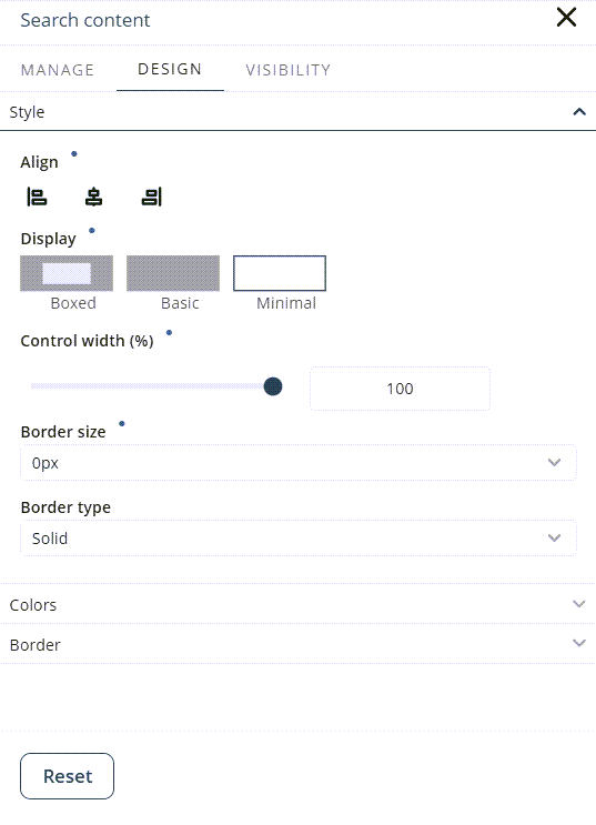
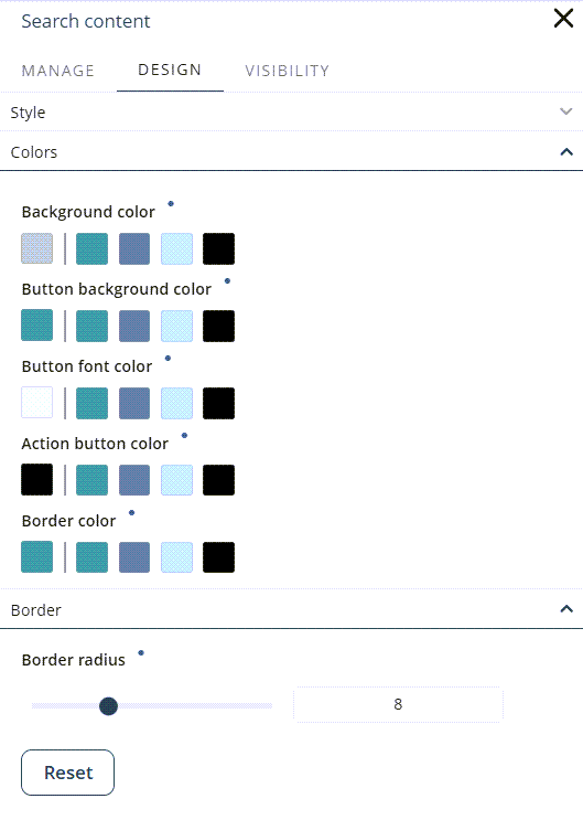
Design options
This section lets you customize the appearance of the Collections Search control.
•Style: Adjust alignment (left, center, or right), width, border size, and border style.
•Colors: Set colors for the background, buttons, and border.
•Border: Modify the border radius.
|
•Click the Reset button to restore the default settings. •Properties with inherited values display a blue dot next to their title. This indicator allows you to make targeted adjustments without affecting other settings. Hover over the blue dot to see the source of the inherited value, giving you greater control over your text control’s appearance. When you modify a property marked with a blue dot, its individual Reset button appears. Clicking this button restores the property to its default inherited configuration. |
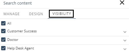
Visibility options
Specify which Personas can see the Collections Search control.
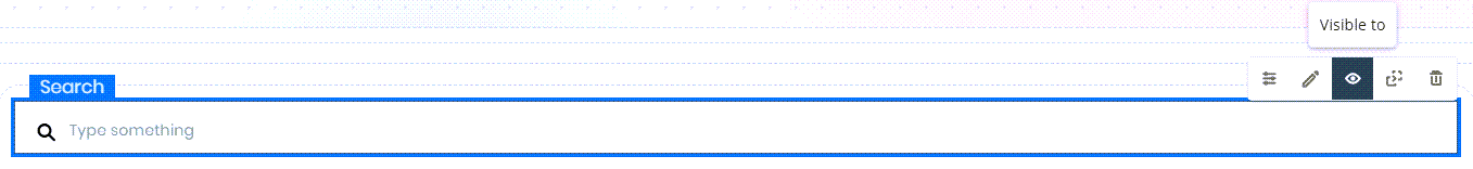
Select All to make it visible to all Personas, or choose specific ones.
Considerations
Keep the following in mind when using the Collections Search control:
•Searches are combined with any existing filters applied to the Collection controls. These filters use AND and OR logic.
•Searches integrate flexibly with filters and Group By:
oPredefined filters (set by the designer) support configurable AND/OR combinations.
oUser filters (applied at runtime) always combine with AND.
oGroup By (configured by the designer) is applied last, as aggregation. Both AND logic and OR logic can be freely combined.
Example
Suppose the app designer enables Phone, Email, and Name as search attributes, configures a predefined filter (Status = Active OR Status = Pending), and adds Group By Region. Then, at runtime, an app user applies filters (Country = US AND Department = Sales).
The resulting query is:
(Phone OR Email OR Name) AND (Status = Active OR Status = Pending) AND (Country = US AND Department = Sales) → Grouped by Region
Collection Changes and Warnings
If a Collection control linked to the Collections Search control is modified—particularly its data source—a warning message will appear to help prevent compatibility issues.
Data Source Update Process
When you update a Collection control or change its source type, a confirmation dialog appears:
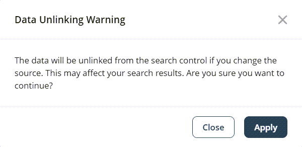
•Close: Keeps the current data source and settings.
•Apply: Unlinks the control and resets it to its default configuration.
This process ensures transparency and gives you control over how changes are handled.
Last Updated 11/19/2025 12:00:43 AM