Overview
The Color palette feature in the App Designer allows you to create, select, edit, duplicate, and delete Color palettes for your apps.
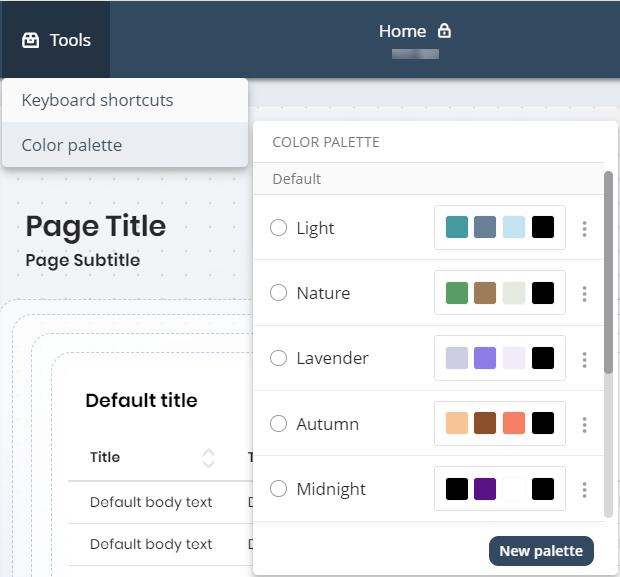
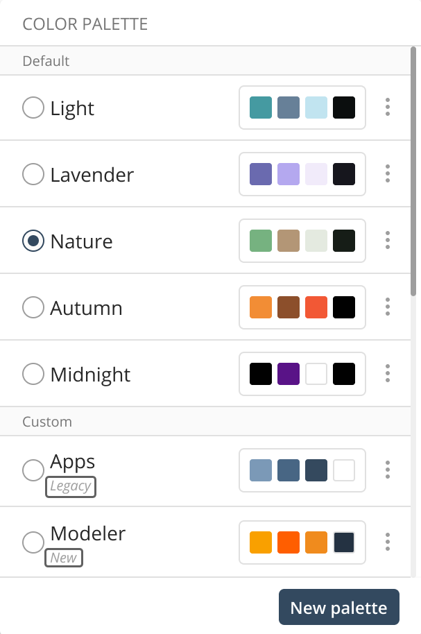
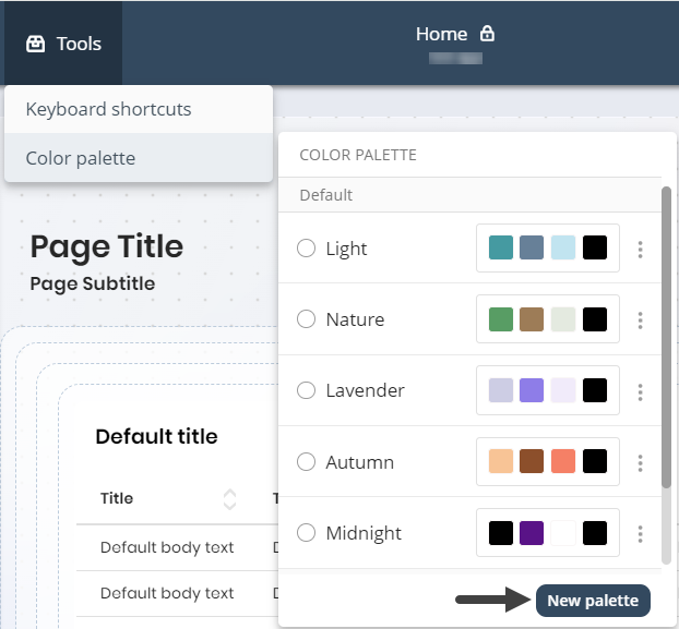
Accessible under the Appearance menu in the App Designer editor, this feature introduces new default palettes—Light, Nature, Lavender, Autumn, and Midnight—and lets you manage both Default palettes (created by Bizagi) and Custom palettes (created by you) to enhance the visual appeal and consistency of your apps.
Use Cases
•Creation of a new Palette.
•Edition of a selected Palette.
•Duplication of a selected Palette.
•Deletion of a selected Palette.
•Selection of a default Palette.
Creating a new palette
To Create a New Palette follow these steps:
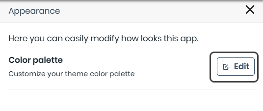
1.In the App Designer Home page, click Settings in the top bar, then select Appearance.
2.The Appearance column will appear on the right side of the window. Click Edit.
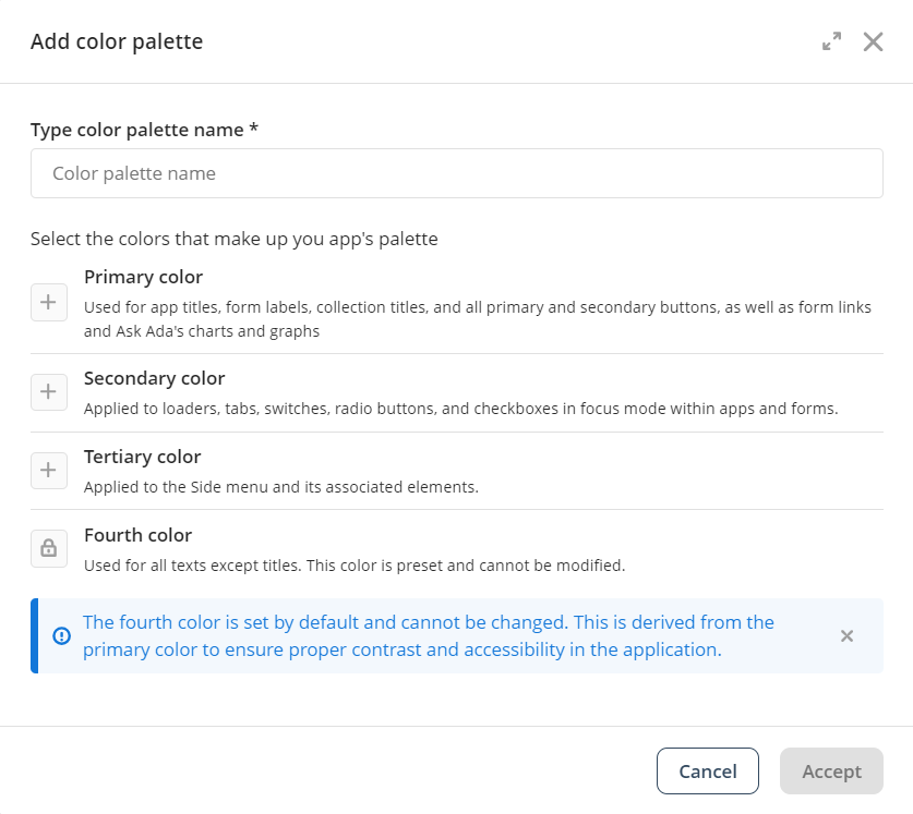
3.Click the Add New button.
|
Duplicate palette names are not allowed. You can modify existing palettes if needed. |
|
Note that under the name of your chosen palette, you will see the colors that make up your palette, along with their designated roles in the composition (Primary, Secondary, Tertiary, Fourth). |
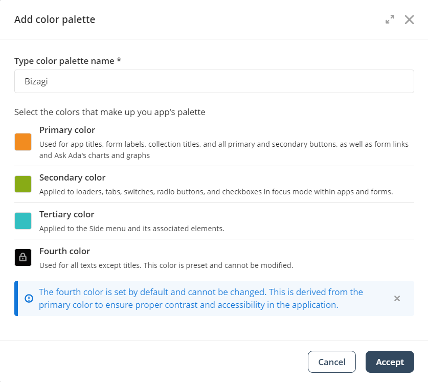
4.Give your Color Palette a name, select your preferred Primary, Secondary, and Tertiary colors, then click Save and Apply.
A Color palette consists of the following colors:
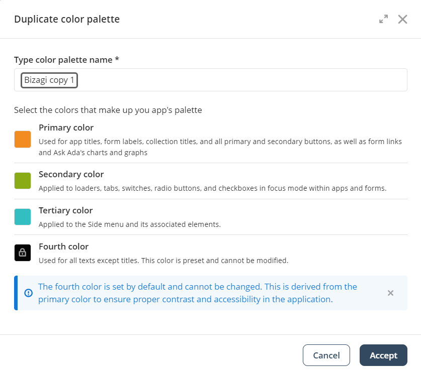
•Primary color: Used for app titles, form labels, Collection titles, and all primary and secondary buttons, as well as form links and Ask Ada's charts/graphs.
•Secondary color: Applied to loaders, tabs, switches, radio buttons, and checkboxes in focus mode within apps and forms.
•Tertiary color: Applied to the Side menu and its associated elements.
•Fourth color: Used for all text except titles. This color is preset and cannot be changed (indicated by the lock icon). It is derived from the Primary color to ensure proper contrast and accessibility in your app.
|
Keep in mind that the Color Picker offers four ways to select a color: manually, or by entering a HEX, HSL, or RGB color code.
|
|
Be cautious when using light tertiary colors as this could blend the background and sidebar, making them hard to distinguish. For more information on how color palettes are applied, refer to the Knowledge Base documentation. |
5.You will now see the Color Palette applied to your app.
|
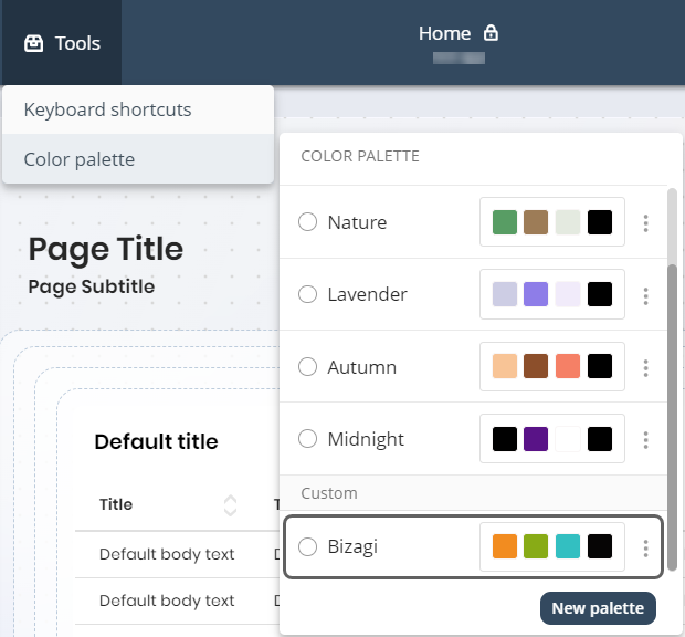
Note that after you create a New Color Palette you will be able to see it under the Custom tag. |
|
Keep in mind that when you create a new palette, it is immediately applied and selected. If you have controls with custom colors, a confirmation modal will ask whether you want to overwrite them or keep your customizations. |
Edit a selected Palette
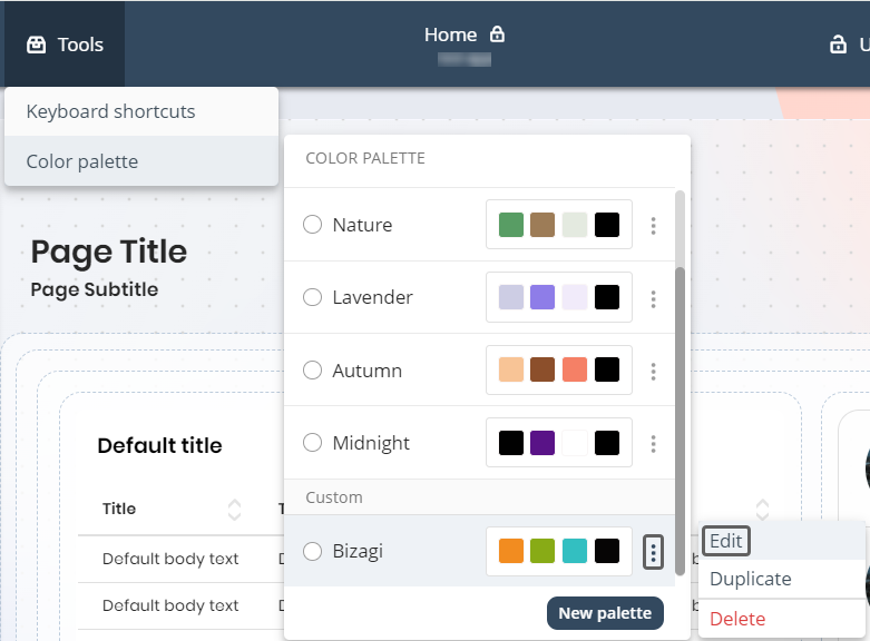
To Edit a Selected Palette, first choose a Palette, then open the three-dotted menu and click Edit.
Now you will be able to change the name and the Primary, Secondary and Tertiary colors. Once you are done click Update.
|
This option is only available for custom Color palettes. Default Color palettes cannot be edited. |
|
Be aware that when you save changes to the active palette, a confirmation modal will appear since edits take effect immediately. |
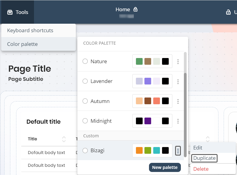
Duplicate a selected Palette
To Duplicate a Selected Palette, first choose a Palette, then open the three-dotted menu and click Duplicate.
Give the Color palette duplicate a Name and if you want change the Primary, Secondary and Tertiary colors. Once you are done click Save and apply.
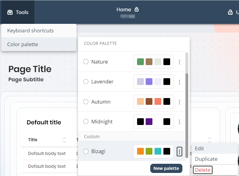
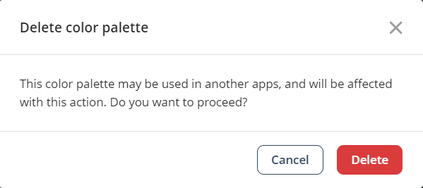
Delete a selected Palette
To delete a selected Palette, first choose a palette, then open the three-dotted menu and click Delete.
A warning pop-up will appear, asking you to confirm the deletion of the Color Palette. Click Delete to proceed.
|
This option is only available for custom Color palettes. Default Color palettes cannot be deleted. |
|
Remember that if you delete the selected palette, the system will automatically switch to the default Light palette. If you have custom-colored controls, a confirmation modal will prompt you to confirm your action. |
Select a Default palette
To select a Default Palette, choose a palette under the Default tag. These palettes are pre-created by Bizagi, allowing you to use them without needing to create a new one. You have the option of choosing between:
•Light.
•Nature.
•Lavender.
•Autumn.
•Midnight.
Button Control and Side menu customization overrides
•Button Control: When you select a specific Background color for a Button Control, a set of colors is automatically generated and applied to various button states, including hover, active, and text colors.
•Side menu: Choosing a specific Background color for the Side menu will generate colors that apply to elements like the Side menu background, Page names, and active states.
•Side menu font color: Selecting a specific Page font color overrides the Color palette settings and is consistently applied across all Side menu text states.
Further considerations
•New apps: When creating a new app and configuring the app style, the default background type is set to Color with the Light palette, and the container style is set to Blurred.
•Background modifications: Changes to the selected Color palette will not immediately affect the app’s background. The background will only update if modified through the App configuration or when a new palette is selected.
•Refer to the Themes documentation for information on customizing Theme Color Palette.
Last Updated 11/19/2025 2:50:37 PM