Overview
Convert to is a feature that lets you change the type of a Collection control while retaining its original properties and parameters. The available Collection controls you can convert are: Card Link, List Collection, Small Card, and Data table.
How to use the Convert to feature
To use the Convert to feature, click the Collection control on your page to display its configuration options. In this menu, select Convert to.
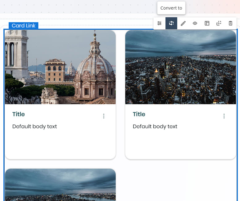
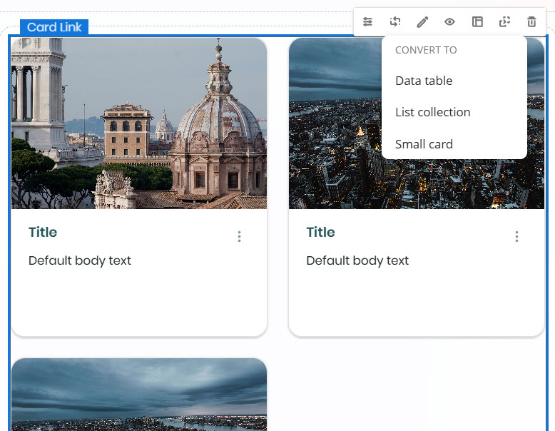
When you click this option, a drop-down list shows the other available Collection controls. Select the one you want to convert the current control into.
A warning message appears, indicating that some elements may be unlinked—meaning they won't be shown in the converted Collection control due to differences in structure. For example, converting a Card Link control to a List collection control may result in images not being displayed.
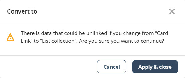
Click Apply & Close to confirm the changes.
|
When an element is not shown after conversion, it is not deleted—it is simply hidden. It will appear again if you convert the Collection control back to one that supports that element. |
Bizagi automatically converts the Collection control, preserving the original properties and parameters. This applies to both static and dynamic content.
Convert to behavior for Data table controls
Because the Data table control displays information differently, there are specific considerations when converting to or from this Collection control.
Converting from a Data table control
When converting a Data table control to other Collection controls, the following mappings apply:
Card Link
•Title: First non-image column
•Text: Second non-image column
•Image: First column configured as image type
List Collection
•Title: First non-image column
•Text: Second non-image column
•Image: Not displayed
Small Card
•Title: First non-image column
•Description: Second non-image column
•Caption: Third non-image column
•Image: First column set as image type
Converting to a Data table control
When converting from other Collection controls to a Data table control, the layout will follow this structure:
•First column: Image, if available
•Second column: Title
•Third column: Text or description, depending on the origin control
•Last column: Caption, if available
Field restrictions
Each Collection control supports a limited number of fields for conversion:
•Card Link: Title, Text, Image (up to 3 fields; additional fields are not converted)
•List Collection: Title and Text only
•Small Card: Title, Description, Caption, and Image (up to 4 fields)
|
Data from unsupported fields is retained in the collection but not shown in the user interface. |
Last Updated 11/19/2025 12:00:43 AM