Overview
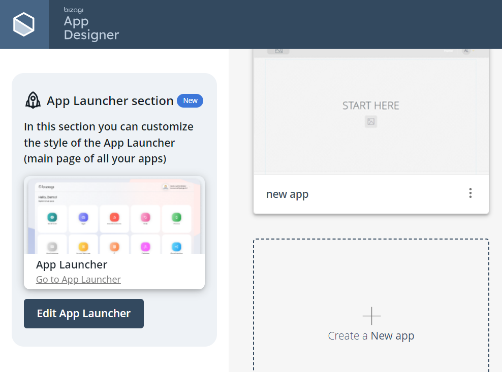
On the side menu of the App Designer home page, you will find the App Launcher section. Here, you can open the App Launcher by clicking Go to App Launcher or customize its interface by selecting Edit App Launcher. This article focuses on the customization process.
Customizing the App Launcher
To modify the App Launcher, click Edit App Launcher. This opens the configuration window, which includes a three-step setup: App Information, Style, and Summary.
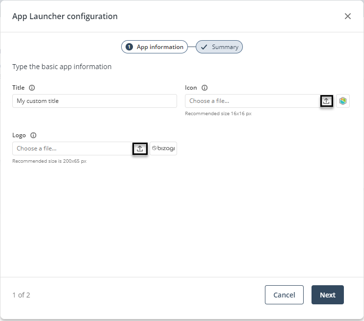
App information
In this first step, you can customize the following elements:
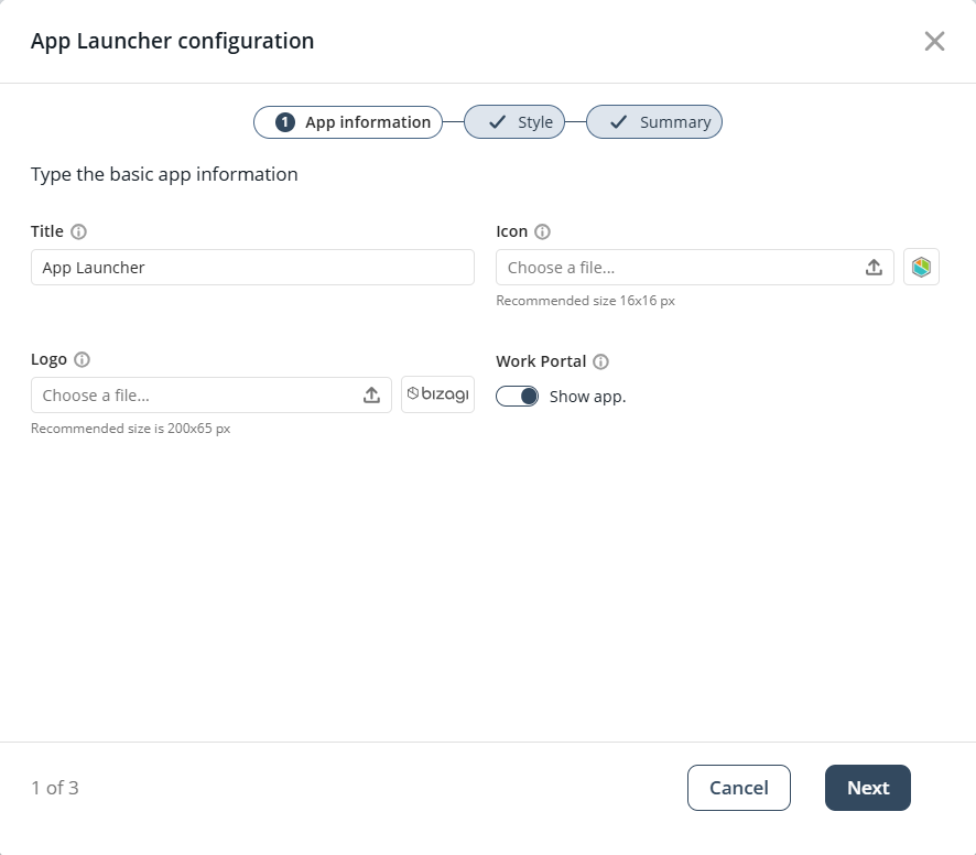
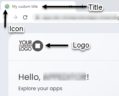
•Title: Sets the name displayed on the web browser tab. By default, this is "App Launcher."
•Icon: Defines the favicon shown in the browser tab. By default, it uses Bizagi’s icon.
•Logo: Specifies the logo displayed within the App Launcher interface. The default is Bizagi’s corporate logo.
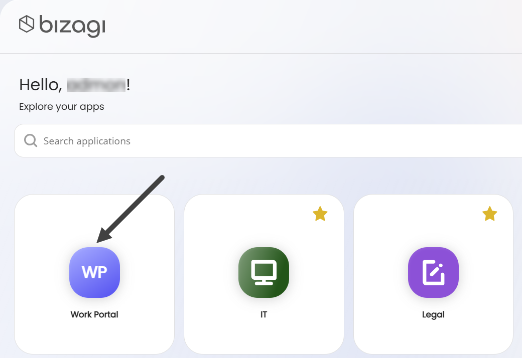
•Work Portal: Toggle switch that determines if the Work Portal app appears first in the App Launcher. It is enabled by default.
Field size recommendations
To ensure the best experience, follow these size guidelines:
•Title: Fewer than 50 characters.
•Icon: PNG, JPG, SVG, JPEG, or ICO formats, with a recommended size of 16x16 pixels.
•Logo: PNG, JPG, SVG, JPEG, or ICO formats, with a recommended size of 200x65 pixels.
To upload a new image for the icon or logo, click the upload icon.
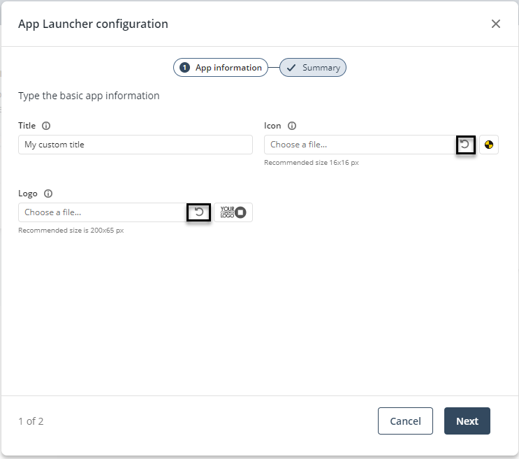
Restoring default values
You can reset any field to its default settings:
•Title: Clearing the text box restores the default title.
•Icon/Logo: After uploading an image, the upload icon changes to a restore icon. Clicking it removes the custom image and reinstates the default one.
Once you finish configuring App Information, click Next to proceed to Style.
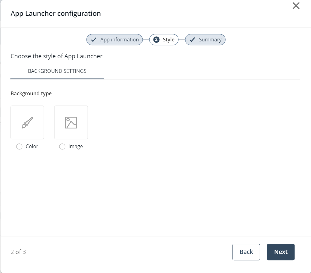
Style
In this step, you can customize the App Launcher’s background by choosing a color or an image, as well as its style, in the Background Settings and Customizations tabs, respectively.
By default, no background option is selected.
Background settings
Use this section to define the appearance of your App Launcher’s background. You can choose a solid color or upload an image to create a more personalized look. Adjust these options to match your brand, highlight important visual themes, or create a more engaging user experience.
Color option
Selecting Color displays the color picker tool and default colors. To access the color picker tool, click the first box from left to right.
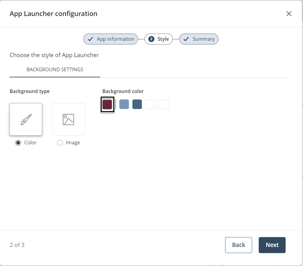
Once you define a color, you can add it to My Color Library for future use by clicking Add Color.
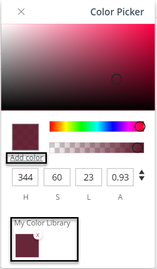
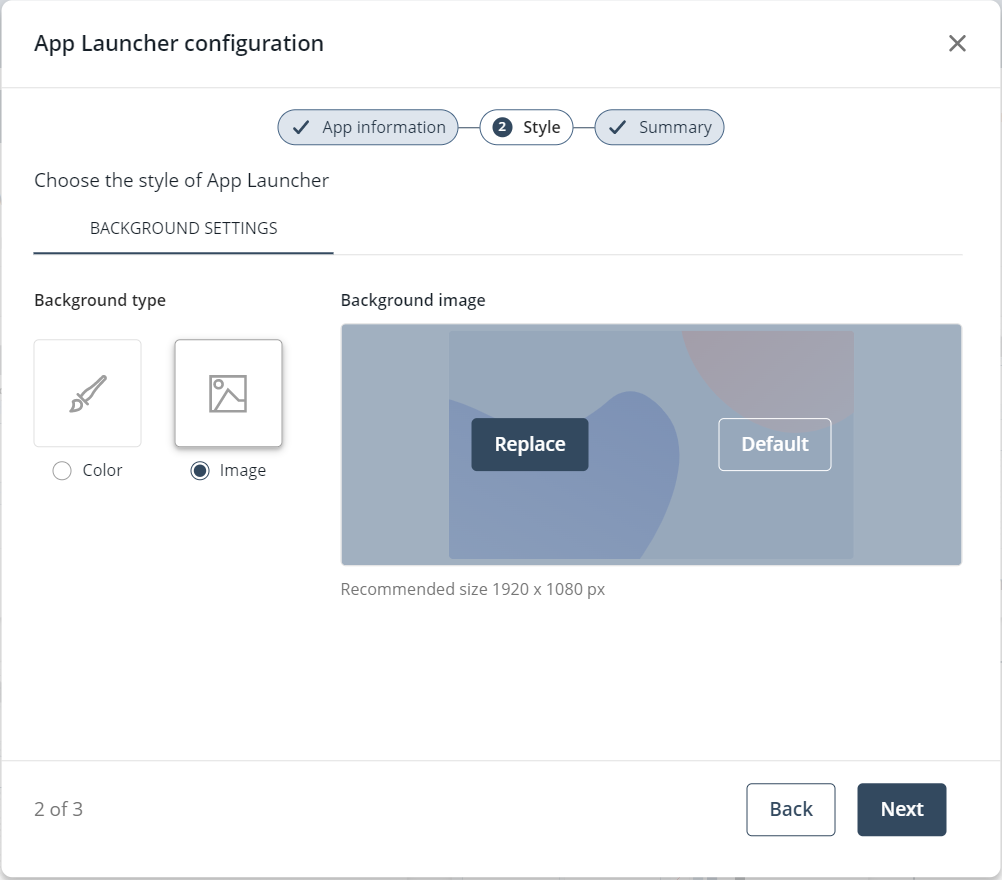
Image option
Selecting Image sets the default background image. To restore the default image, click Default. If the default image is in use, click Replace to upload a custom background.
Background recommendations
For an optimal experience, follow these guidelines:
•Color: Choose from default colors or use the color picker tool. Available formats: RGBA, HSLA, and HexA. Navigation arrows allow format switching. My Color Library holds up to eight colors; once full, the Add Color button is disabled.
•Image: PNG, JPG, SVG, JPEG, or ICO formats, recommended size 1920x1080 pixels.
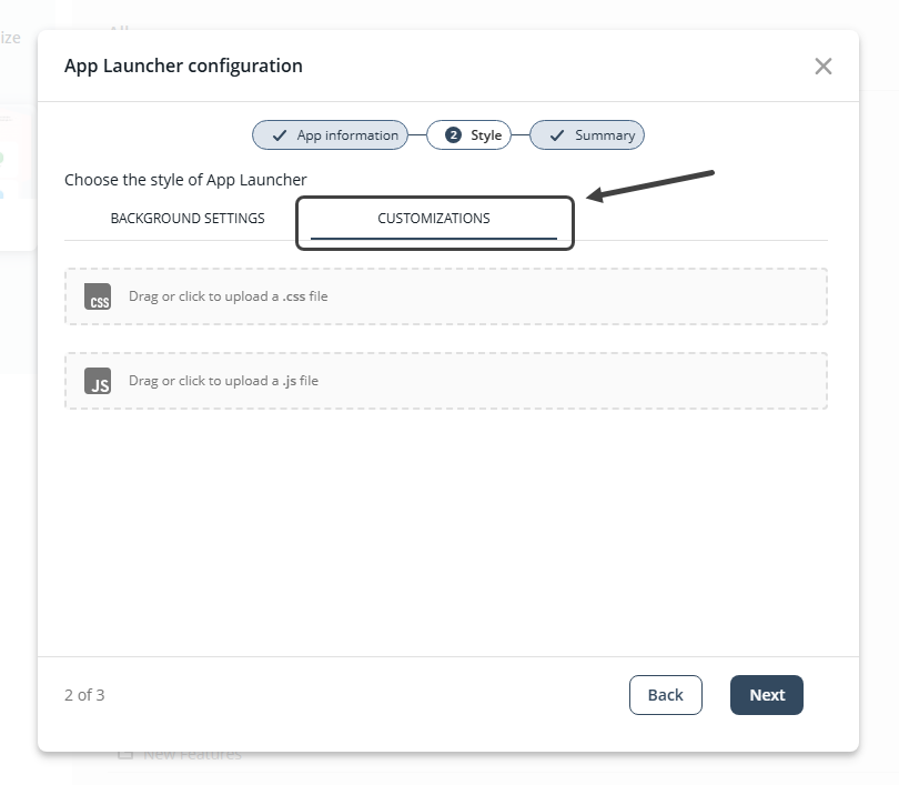
Customizations
Use this section to enhance and personalize the App Launcher by applying custom styles and behaviors. You can upload .css and .js files to override default visual elements or introduce custom interactions. These overrides allow you to tailor the interface to your specific design, branding, or functional requirements. To use this feature just drag or click to upload your files.
Once you finish configuring Style, click Next to proceed to Summary.
|
If you wish to read more about the Customizations window, refer to the Customizations article. |
Summary
In this final step, you can review the App Information and Style settings configured in the previous steps.
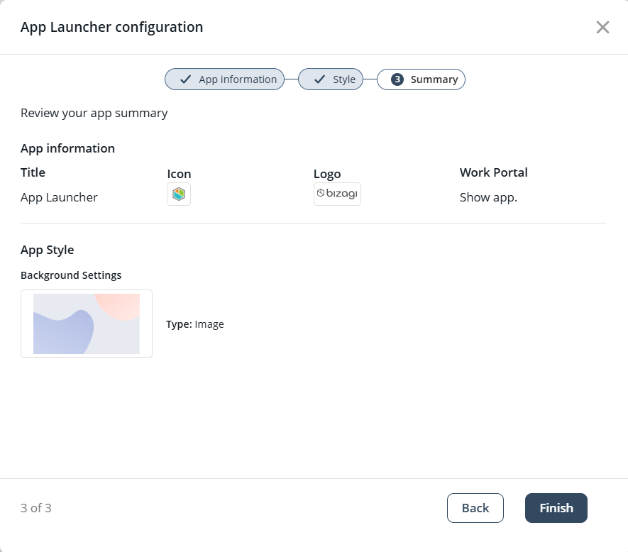
Click Finish to save the changes and close the wizard.
App icon
When creating or customizing an app, you can change how the app icon (the box with the app name within the App Launcher) appears. For more details, see the App style article.
Last Updated 11/19/2025 3:34:13 PM