|
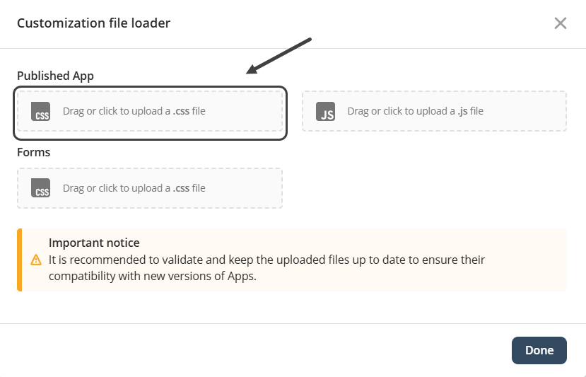
Considerations •This article is specifically designed for those people who understand CSS and HTML. •We strongly recommend using Google Chrome to facilitate the different taks related to this Feature. •Take into account that in this guide we are going to use Visual Studio Code to create the .css and .js, but you are free to use the tool you prefer. |
If you want to find the specific IDs of the elements you want to customize, refer to the Finding IDs in the Inspector article.
Overview
It is the CSS file used to redefine or extend the default visual styles applied to Bizagi controls. It includes specific selectors for text controls, number controls, date pickers, combos, buttons, grids, and other elements used across formas in your app. These selectors can be modified to adapt the interface to the branding or functional requirements of your application
When you modify the body selector in the apps customization CSS file, you are applying global styles to the entire apps interface. The body selector defines the base visual properties for the whole page, so any change made here affects all screens and controls unless another, more specific CSS rule overrides it.
These are the list of elements that you can modify in your app:
•Body
•Text
oTitle
oSubtitle
oParagraph
•Media
oImage
•Buttons
oText Button
oIcon Button
oLink
•Collections
oData table
oCard Link
oList collection
oCollections
oSmall card
•Experience Elements
oScorecards
•Embeds
oEmbed a website
oHTML iFrame
Body
1. Global text color
Controls, labels, and general text inherit this color unless they define their own.
Example
This changes the color of all default text across the apps page.
body {
color: red;
}
2. Background color or background image
This sets the overall background for the Apps page.
Examples
Background color example:
body {
background-color: purple; /* Light gray background */
}
Background image example:
body {
background-image: url("../images/app-background.png");
background-size: cover;
background-repeat: no-repeat;
}
3. Default font styles
Font family, size, and weight applied here become the baseline for all elements.
Example
Changing the global font family and size:
body {
font-family: "Segoe UI", sans-serif;
font-size: 15px;
}
4. Page spacing
Modifying margin or padding can adjust how the entire Apps layout is positioned.
Examples
Removing default browser spacing:
body {
margin: 0;
padding: 0;
}
Adding custom spacing around all content:
body {
padding: 20px; /* Adds 20px space around entire Apps interface */
}
5. Layout behavior
Properties such as display, flex, or line-height influence how the main structure of the page behaves.
In short, updating the body selector in the Bizagi apps CSS file changes the global visual foundation of the apps interface, influencing all screens and elements unless a more specific style overrides it.
Text
1. Customizing <h1> Titles
Example: Larger size, bold weight, and custom color
h1 {
font-size: 28px;
font-weight: 700;
color: #003366; /* Dark blue */
margin-bottom: 12px;
}
2. Customizing <h2> Titles
Example: Slightly smaller than h1, with different spacing
h2 {
font-size: 22px;
font-weight: 600;
color: #005599; /* Medium blue */
margin-top: 20px;
margin-bottom: 10px;
}
3. Customizing <p> Paragraphs
Example: Softer color, adjusted line spacing, and justified text
p {
font-size: 15px;
color: #333333; /* Soft dark gray */
line-height: 1.6;
text-align: justify;
margin-bottom: 14px;
}
Media
This example demonstrates how you can apply multiple visual enhancements to image elements using a single CSS rule. By styling the img selector directly, you can adjust the global appearance of all images in your Bizagi app. The rule combines several common modifications, including resizing, rounded corners, borders, shadows, opacity adjustments, and a hover effect. These combined properties help create a consistent and polished look for images across your application, improving both aesthetics and usability.
img {
/* Size and responsiveness */
width: 200px;
max-width: 100%;
height: auto;
/* Shape and style */
border-radius: 16px; /* rounded corners */
border: 2px solid #0047ab; /* blue border */
/* Visual enhancements */
box-shadow: 0 4px 12px rgba(0, 0, 0, 0.25); /* shadow */
opacity: 0.9; /* slight transparency */
/* Smooth transitions */
transition: transform 0.2s ease, opacity 0.2s ease;
}
/* Hover effect */
img:hover {
transform: scale(1.05);
opacity: 1;
}
Buttons
This example illustrates how to enhance the appearance and interactivity of buttons using CSS. By targeting the button selector, you can ensure a consistent look across all button elements in your Bizagi App. The rule below applies modern styling such as rounded corners, custom colors, padding, smooth transitions, and hover effects to improve visual appeal and usability.
button {
/* Structure and size */
padding: 10px 18px;
font-size: 15px;
font-weight: 600;
/* Colors and appearance */
background-color: #0074d9; /* bright blue */
color: white;
border: none;
border-radius: 8px;
/* Visual enhancements */
box-shadow: 0 2px 8px rgba(0, 0, 0, 0.18);
/* Cursor and transitions */
cursor: pointer;
transition: background-color 0.2s ease, transform 0.2s ease;
}
/* Hover effect */
button:hover {
background-color: #0059a8; /* darker blue */
transform: translateY(-2px);
}
Collections
This example shows how you can style collection controls (grids or grouped grids) to improve readability and usability. The following rules customize headers, rows, text alignment, borders, and background colors used for alternating rows. These changes help users interpret information more quickly and improve visual hierarchy.
/* Header styling */
.bzg-form-grid th,
.bzg-form-groupedgrid th {
background-color: #003366; /* dark blue */
color: white;
font-weight: 600;
padding: 10px;
text-align: left;
}
/* Row styling */
.bzg-form-grid td,
.bzg-form-groupedgrid td {
padding: 8px 12px;
border-bottom: 1px solid #dddddd;
color: #333333;
}
/* Alternating row color */
.bzg-form-grid tr:nth-child(even),
.bzg-form-groupedgrid tr:nth-child(even) {
background-color: #f5f8fc; /* light blue tint */
}
/* Hover effect for rows */
.bzg-form-grid tr:hover,
.bzg-form-groupedgrid tr:hover {
background-color: #e4eef7;
}
Experience Elements
Experience elements such as cards, containers, and sections can benefit from subtle styling to create visual separation, depth, and organization. The example below applies padding, rounded corners, background color, shadows, and consistent spacing to enhance presentation and readability.
.experience-card,
.experience-container,
.experience-section {
/* Layout and spacing */
padding: 16px;
margin-bottom: 20px;
/* Appearance */
background-color: #ffffff;
border-radius: 12px;
border: 1px solid #dddddd;
/* Elevation */
box-shadow: 0 3px 10px rgba(0, 0, 0, 0.1);
}
/* Optional title styling inside elements */
.experience-card h2,
.experience-section h2 {
font-size: 20px;
color: #003366;
margin-bottom: 10px;
}
Embeds
Embedded content—such as videos, external pages, maps, or iFrames—can be made more visually appealing and responsive with CSS rules that control size, borders, spacing, and aspect ratio. The example below provides a clean embedded media frame that scales properly and integrates well with surrounding components.
iframe,
.embed-container {
/* Size and responsiveness */
width: 100%;
max-width: 100%;
height: 400px;
/* Appearance */
border: none;
border-radius: 12px;
overflow: hidden;
/* Visual enhancements */
box-shadow: 0 4px 16px rgba(0, 0, 0, 0.2);
background-color: #ffffff;
}
/* Optional hover effect */
iframe:hover,
.embed-container:hover {
box-shadow: 0 6px 20px rgba(0, 0, 0, 0.25);
}
|
Remember that for certain elements it is necessary to use the specific IDs of the elements you want to customize. Refer to the article Finding IDs in the Inspector if you have any questions. |
|
Note that you do not need to republish an app to see the changes made using this feature. Once a file is uploaded the app will show the desired customizations automatically. |
Last Updated 12/9/2025 10:29:08 AM