Overview
This section provides at-a-glance metrics on case creation/closure, work item execution, Apps usage, delayed, disabled and pending tasks. It includes trend analysis to show usage over time. Key figures are displayed, with links to detailed dashboards for deeper analysis.
To better understand these metrics, it is important to distinguish between Case and Workitem:
Case |
Workitem |
|---|---|
Represents a single instance of a process, including all related tasks, activities, and data. •Example: each customer complaint in a complaint-handling process would be a separate case. Cases track the overall progress and status of the process. |
Refers to an individual task or activity within a case. It is a smaller unit of work assigned to a user or system, such as reviewing a document or approving a request. A Case typically contains multiple Workitems, each representing a step in the process. |
In summary, a Case represents the entire process instance, while a Workitem is an individual task within that process. Monitoring both helps track overall process progress (Cases) and the completion of specific tasks (Workitems).
Home Monitoring Metrics
The Metrics pillar on the Monitoring Center Home displays key indicators that offer insights into process efficiency, workload distribution, user engagement, and potential bottlenecks. These metrics help you make informed decisions and optimize workflows. Over time, trends in these metrics will reflect the behavior of your processes. For example, if case creation increases but closures lag behind, or if your case backlog grows, it may signal inefficiencies that require process review.
Pay special attention to metrics highlighted in red—these indicate areas where action may be needed.
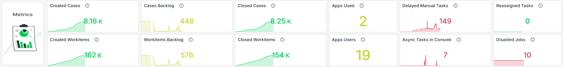
Created Cases
This widget displays the cumulative number of cases that have been created within the specific time frame. The data calculated using a sum over time. The tile offers insights into process workflow efficiency.
Cases Backlog
This widget displays the total number of open cases over the specified period. It provides an aggregated view of open cases in 15-minute intervals, helping to monitor and manage case backlog effectively.
Closed Cases
This widget displays the cumulative sum of closed cases over the specified period. The metric is calculated by summing up the number of closed cases within an hourly interval, with data offset by 75 minutes to ensure accuracy in time-based reporting.
Created Workitems
This metric displays the total number of work items created over a specified period. The metric is calculated by summing up the new work items within an hour, with an offset of 75 minutes. It provides insight into the volume of work initiated in the system during this timeframe.
Workitems Backlog
This widget displays the total number of open work items accumulated over the specified period. The metric is calculated by summing the values of open work items in 15-minute intervals, offset by 15 minutes to account for recent data changes.
Closed Workitems
This widget displays the total number of closed work items over the specific period. It provides an accumulated count, reflecting how many work items have been completed or closed within the monitored timeframe.
Apps Used
This widget shows the count of distinct Bizagi Apps used within a specified timeframe. It calculates the metric by filtering logs to identify unique applications accessed. The result provides insight into application engagement and utilization.
Apps Users
This widget displays the number of distinct users interacting with applications over the given period. The metric is derived by filtering data to count unique user profiles accessing the applications, providing an overview of user engagement and activity levels.
Delayed Manual Tasks
This widget displays the total number of delayed manual tasks, summing up the delayed manual work items. It displays how the number of tasks delayed has changed over time, along with the current count. This provides an overview of manual tasks that have not been completed within the expected time frame, highlighting potential bottlenecks in process execution. The graph turns red when it reaches 50 (not customizable).
Async Tasks In Console
This widget shows the total number of asynchronous tasks currently present in the Async console, requiring human interaction to move forward. It displays how the number of tasks in console has changed over time, along with the current count.
Reassigned Tasks
This widget displays the total number of tasks that have been reassigned within the given time frame. If there are more than 50 reassignments, the graph turns red to signal a potential issue (this number is not customizable). A high number of reassignments may indicate a problem in task allocation definitions that should be reviewed, as frequent reassignments over time suggest that tasks are not being designed or assigned correctly.
Disabled Jobs
This widget shows the total number of jobs that have been disabled. This provides insight into workflow interruptions and helps identify areas where job execution has been halted, requiring human interaction to move forward.
Last Updated 11/19/2025 12:04:59 PM