Overview
The Metrics dashboard leverages process names and studio-defined categories as dimensions, providing a breakdown beyond total figures. You can filter the category or process to analyze by selecting the desired one on the drop-down menus on the top of the dashboard.
On the top ribbon, you can find two buttons that take you to two different metric detail windows: Metrics Details and Metrics Trends & Forecast (to check AI - Operations per hour go to AI Metrics details). This allows for analysis per process and categorization of processes, acknowledging variations in usage while highlighting their utility for performance assessment.
Pay special attention to metrics highlighted in red—these indicate areas where action may be needed.
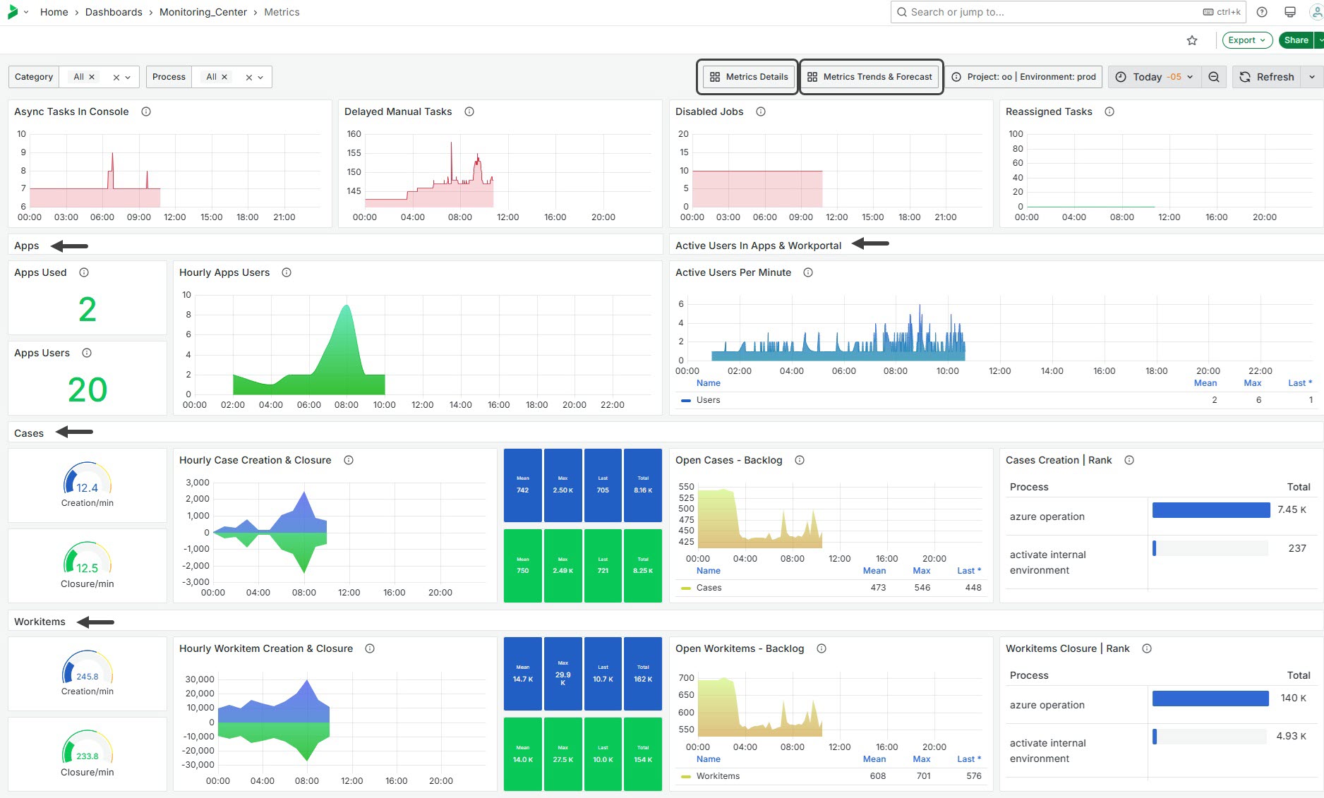
Async Tasks In Console
This widget displays the current number of asynchronous tasks in the Async task console. The metric is calculated using the sum of async tasks for a given process and category. It uses color-coded thresholds to indicate whether there are any tasks present, with green representing zero tasks and red indicating one or more tasks. This provides a quick overview of pending asynchronous operations that might require attention and human intervention.
Delayed Manual Tasks
This widget shows the number of delayed manual tasks. The metric is determined by summing delayed manual work items for a specified process and category. It uses color-coded thresholds to signal task urgency, with green indicating fewer than 50 delayed tasks and red highlighting 50 or more delayed tasks. This provides a visual cue for workload management and helps identify bottlenecks in manual task processing.
This widget shows the total number of asynchronous tasks currently present in the Async console, requiring human interaction to move forward.
Disabled Jobs
This widget shows the total number of jobs that have been disabled. This provides insight into workflow interruptions and helps identify areas where job execution has been halted, requiring human interaction to move forward.
Reassigned Tasks
This widget displays the total number of tasks that have been reassigned within the given time frame. The metric provides insight into task management and workflow adjustments, highlighting areas where task reallocation is occurring.
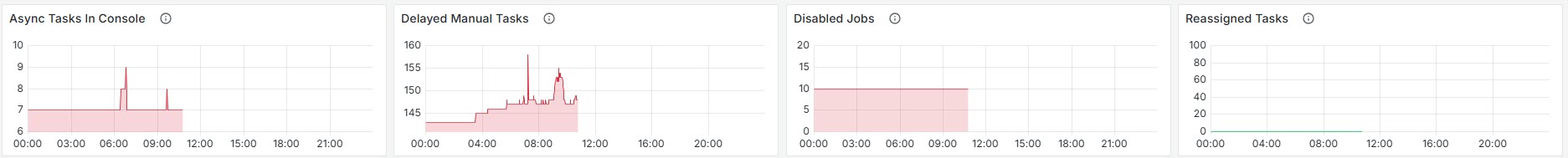
Apps
Apps Used
This widget shows the count of distinct Bizagi Apps used within a specified timeframe. It calculates the metric by filtering logs to identify unique applications accessed. The result provides insight into application engagement and utilization.
Apps Users
This widget displays the number of distinct users interacting with applications over the given period. The metric is derived by filtering data to count unique user profiles accessing the applications, providing an overview of user engagement and activity levels.
Hourly Apps Users
This widget represents the number of users accessing applications on an hourly basis. This metric helps in understanding user engagement patterns throughout different hours of the day, allowing for analysis of peak usage times.
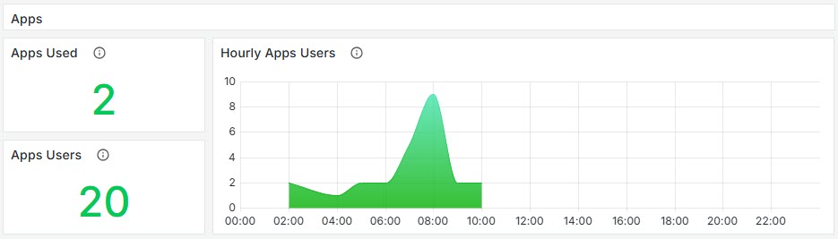
Active Users in Apps & Work Portal
Active Users Per Minute
This widget tracks the number of unique active users accessing applications: Work Portal or Apps. This metric is valuable for analyzing user engagement in real-time, helping identify usage trends and potential performance issues at a granular level. Every line of the graph is registered every 5 minutes, displaying over time the number of unique users using the Work Portal. As an end users logs in, their interaction is counted.
Cases and Workitems
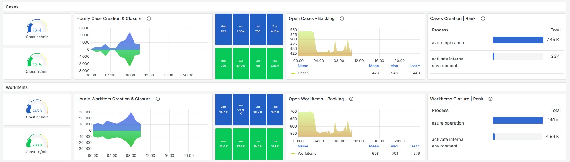
Creation/min
This widget measures the average number of Case or Workitem creations per minute. It calculates this metric by taking the total count of creations and dividing it by 60, representing the average over an hour interval.
Closure/min
This widget displays the average number of Case or Workitem closures per minute. It calculates this metric by dividing the total count of closures by 60, reflecting an hourly average.
Hourly Case Creation & Closure
This widget tracks the number of Cases or Workitems created and closed on an hourly basis. The data is aggregated using the sum of Cases/Workitems over the specified time window. The metric for Case/Workitem creation is displayed with a fixed blue color, while Case/Workitem closure is shown in green. Both metrics are presented as time series data, allowing users to observe trends in case activity over time.
Open Cases / Workitems - Backlog
This widget displays the number of open Cases, over 15-minute intervals. It provides insights into the volume of open Cases that are pending resolution or action, helping users monitor workload and backlog trends effectively.
Mean: The average number of Cases/Workitems created or closed per hour within the selected time range.
Max: The maximum value observed of Cases creation or closure, within the selected time range, per hour.
Last: The last measurement taken, representing the most recent hour recorded.
Total: The total number of Cases/Workitems opened or closed, within the selected time range.
Cases Creation | Rank
This widget presents a ranked table of process based on the number of cases created within 15-minute intervals. The data is aggregated by summing the number of cases created for each process, allowing users to compare case creation activity across different processes. This chart gives an insight on the usage of processes over time: some processes might be widely used while others are never launched.
Last Updated 11/19/2025 12:05:57 PM