Overview
The Trends and Forecast dashboard provides valuable insights into your processes through detailed visualizations and predictive analytics based on historical data. It helps you monitor trends, anticipate future workloads, and make informed decisions. By combining real-time data and forecasts across Cases, Workitems and App usage. You can proactively manage resources, identify patterns, and respond quickly to changes. Over time, this will help you recognize process trends and detect irregular behaviors that may require attention.
The dashboard is divided into several sections: Cases, Workitems, Apps - Active Users Per Hour, and Case & Workitem Trends Last 3 Months.
|
•All metrics in this dashboard can be filtered using the Category and Process drop-down controls on the top left. •The time range filter on the top does not apply to these charts, as they have their own time definition. |
Cases
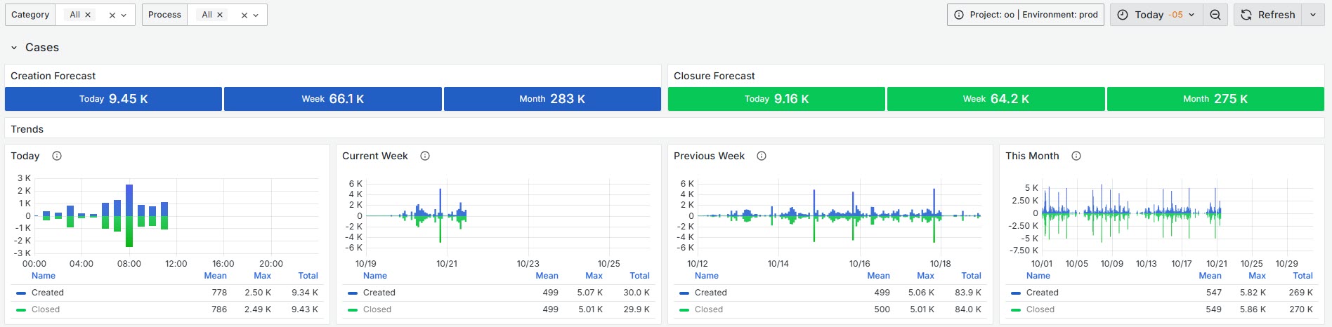
Creation and Closure Forecast
This section displays a forecast of the number of cases that are forecast to be created and closed over different time periods, given the historical information: Today, This week, and This month. The metric is calculated by averaging the historical daily behavior for forecasting calculation.
Creation and Closure Today
This widget shows the trend of cases created and closed today for a specific process and category. To visually separate the data, the number of closed cases is multiplied by -1, placing created cases at the top and closed cases at the bottom. The legend includes summary calculations such as the mean, maximum, and total number of cases for both metrics.
Creation and Closure Current Week
It displays the trend of the number of created and closed during the current week for a specific process and category. To visually separate the data, the number of closed cases is multiplied by -1, placing created cases at the top and closed cases at the bottom.
The legend provides summary calculations including mean, maximum, and sum for both metrics.
Creation and Closure Previous Week
It displays the trend of cases created and closed during the previous week for a specific process and category. To visually separate the data, the number of closed cases is multiplied by -1, placing created cases at the top and closed cases at the bottom.
The legend provides summary calculations including mean, maximum, and sum for both metrics.
Creation and Closure This Month
It displays the trend of cases created and closed during the current month for a specific process and category. To visually separate the data, the number of closed cases is multiplied by -1, placing created cases at the top and closed cases at the bottom.
The legend provides summary calculations including mean, maximum, and sum for both metrics.
Workitems
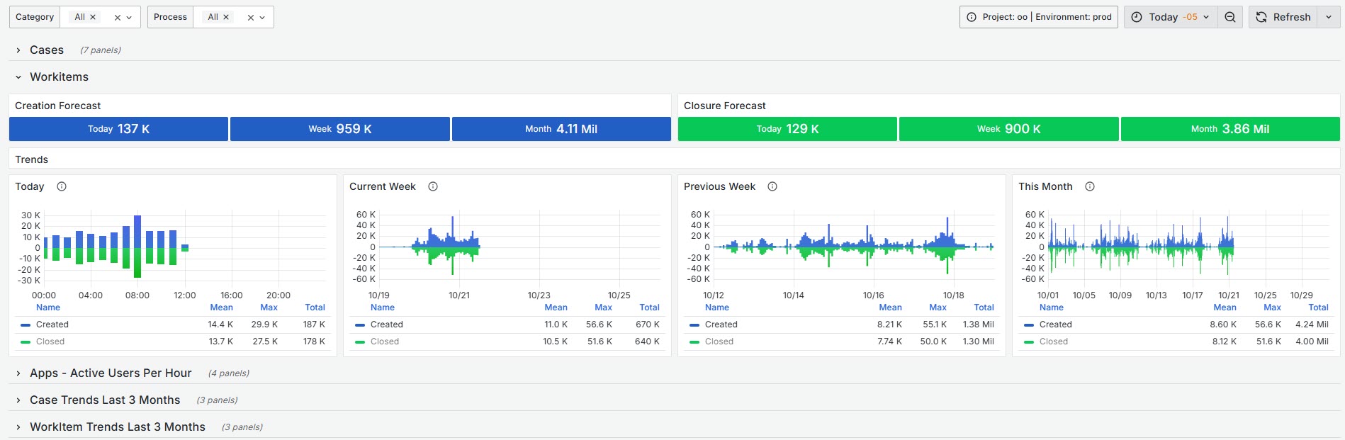
Creation and Closure Forecast
It provides a forecast of the number of new workitems expected to be created and closed over different time frames: today, this week, and this month. The forecast is calculated using the historic creation and closure of work items.
Creation and Closure Today
This widget displays the number of new work items created and the total work items closed today for a specific process and category.
The legend provides summary calculations including mean, maximum, and total for both metrics.
Creation and Closure Current Week
This widget displays the number of new work items created and the total work items closed during the current week for a specific process and category.
The legend provides summary calculations including mean, maximum, and total for both metrics.
Creation and Closure Previous Week
This widget displays the number of new work items created and the total work items closed during the previous week for a specific process and category.
The legend provides summary calculations including mean, maximum, and sum for both metrics.
Creation and Closure This Month
This widget displays the number of new work items created and the total work items closed during the current month for a specific process and category.
The legend provides summary calculations including mean, maximum, and sum for both metrics.
Apps - Active Users Per Hour
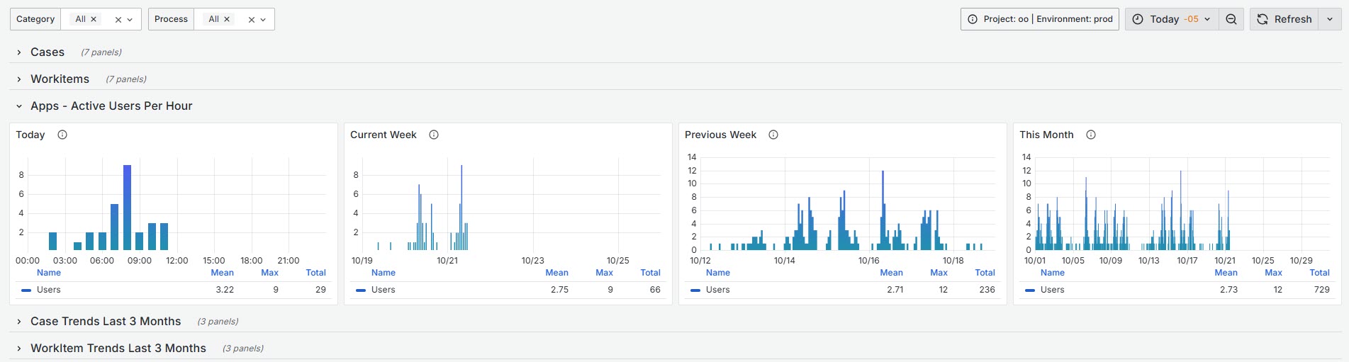
Today
It displays the number of unique users accessing an App environment today every hour.
The legend provides summary calculations including mean, maximum, and total for the users counted.
Current Week
It displays the number of unique users accessing an App environment during the current week, every hour.
The legend provides summary calculations including mean, maximum, and sum for the users counted each hour.
Previous Week
It displays the number of unique users accessing an App environment during the previous week, every hour.
The legend provides summary calculations including mean, maximum, and sum for the users counted each hour.
This Month
It displays the number of unique users accessing an App environment during this month, every hour.
The legend provides summary calculations including mean, maximum, and sum for the users counted each hour.
Case & Workitem Trends Last 3 Months
The Case & WorkItem Trends – Last 3 Months sections offer both executive and operational insights into key metrics related to case and technical task management. These panels are powered by consolidated metrics from Prometheus, providing trend-based and analytical views of operational performance. The data is organized by the current month and the two preceding months, and includes consolidated information from the main environments: Production, Test, and Development.
|
The values presented reflect performance patterns and evolution rather than absolute figures, and should be interpreted as strategic indicators to support decision-making. |
Case Trends Last 3 Months
This dashboard provides a monthly overview of cases created and closed over the past three months. It is designed to help evaluate the effectiveness of case management strategies and operational actions.
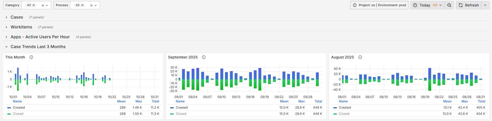
This time series panel uses stacked bar charts to represents the number of cases created and closed each month.
•The vertical axis uses both positive and negative values to visually highlight the balance between case creation and closure.
•Taller blue bars compared to green ones indicate an increase in operational workload (more cases opened).
•When both bars are balanced (or green bars dominate), it reflects a healthy resolution pace and effective backlog control.
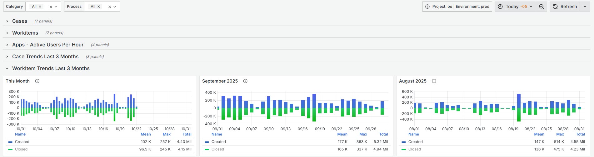
Workitem Trends Last 3 Months
This dashboard complements the case overview by focusing on technical task management. It displays the monthly evolution of Workitems created and closed over the past three months. This visualization helps assess the technical workflow, identifying increases in task assignments or pending items, and measuring monthly resolution efficiency.
|
To access AI Metrics Trends and Forecast (AI- Operations Per Hour) go to the AI Metrics details section. |
Last Updated 11/19/2025 12:41:33 PM